


Brand for an Outstanding Gym
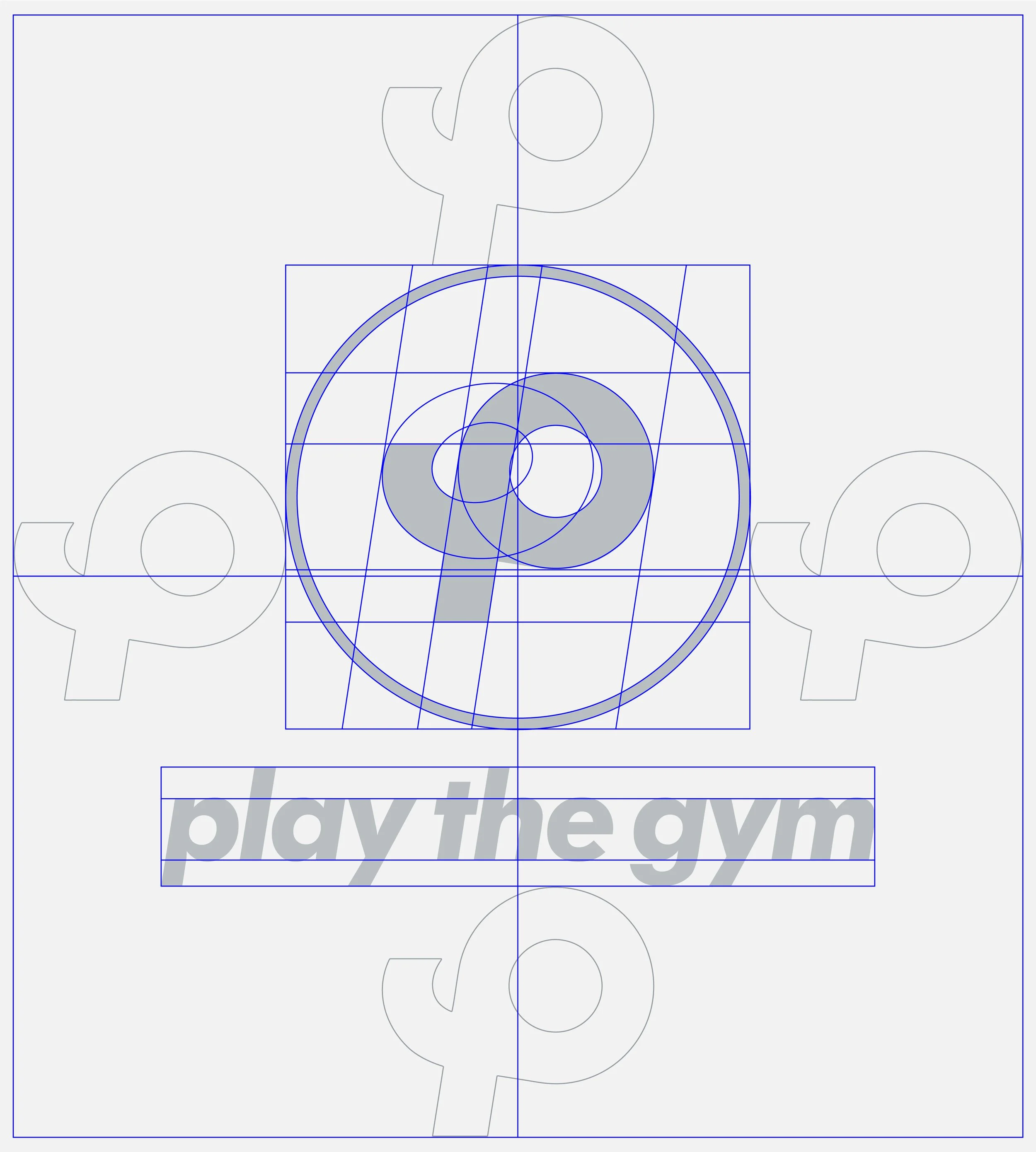
The design of the Play The Gym brand mark revolves around the union of the “P” and “G,” the brand’s initials, which come together to form a third shape. This new shape is not just an abstract symbol but one that reflects the dynamic movement of an athlete in action.
By combining these letters, the symbol subtly captures the energy and fluidity of physical movement, embodying the brand’s core message of making fitness engaging and active.
This approach ensures that the brandmark is more than just a visual identifier—it becomes a representation of the strength, motion, and vitality that define PlayTheGym.

Stacked Circular Brand Lockup


Horizontal Brand Lockup


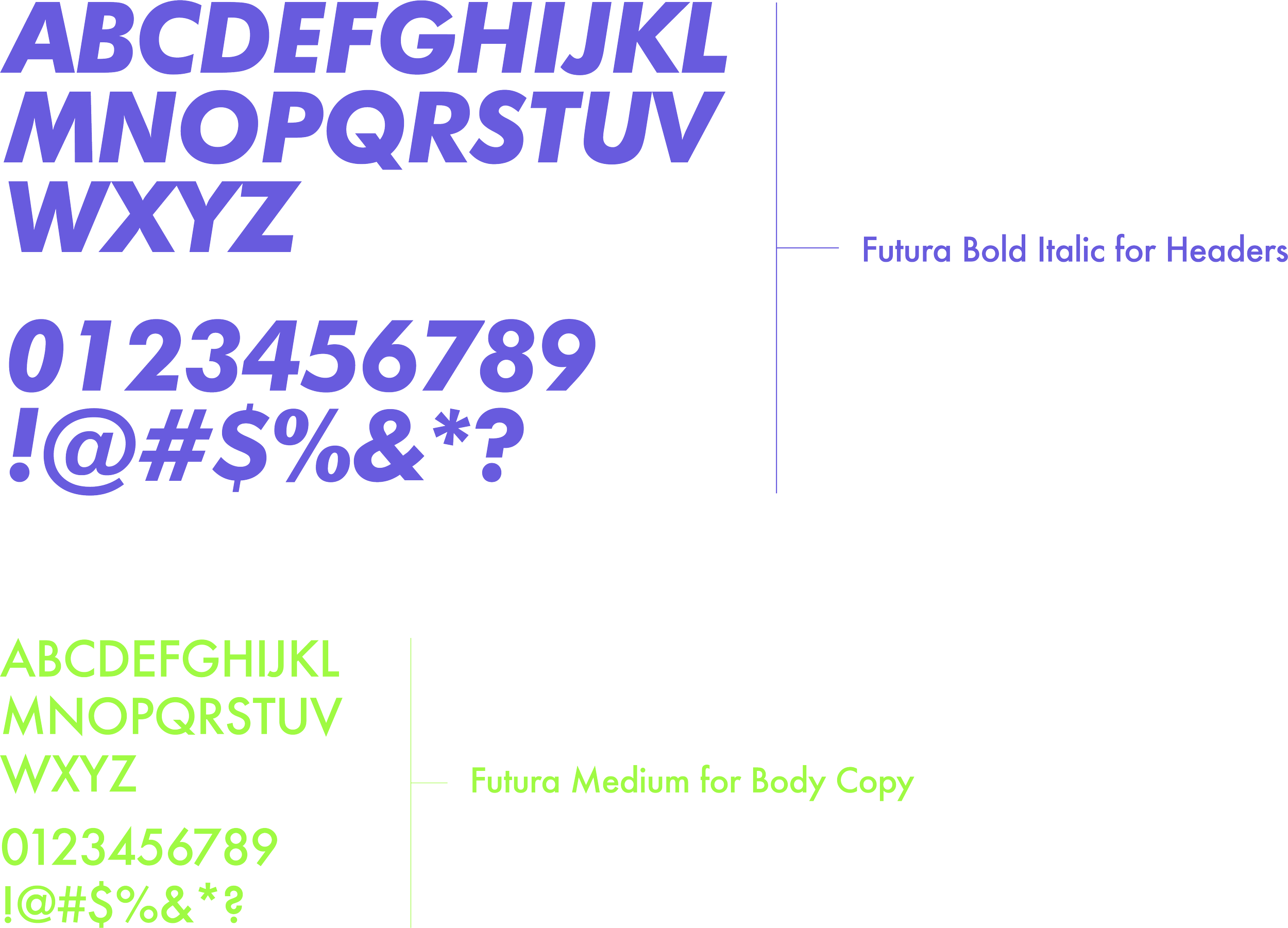
Typography Selection


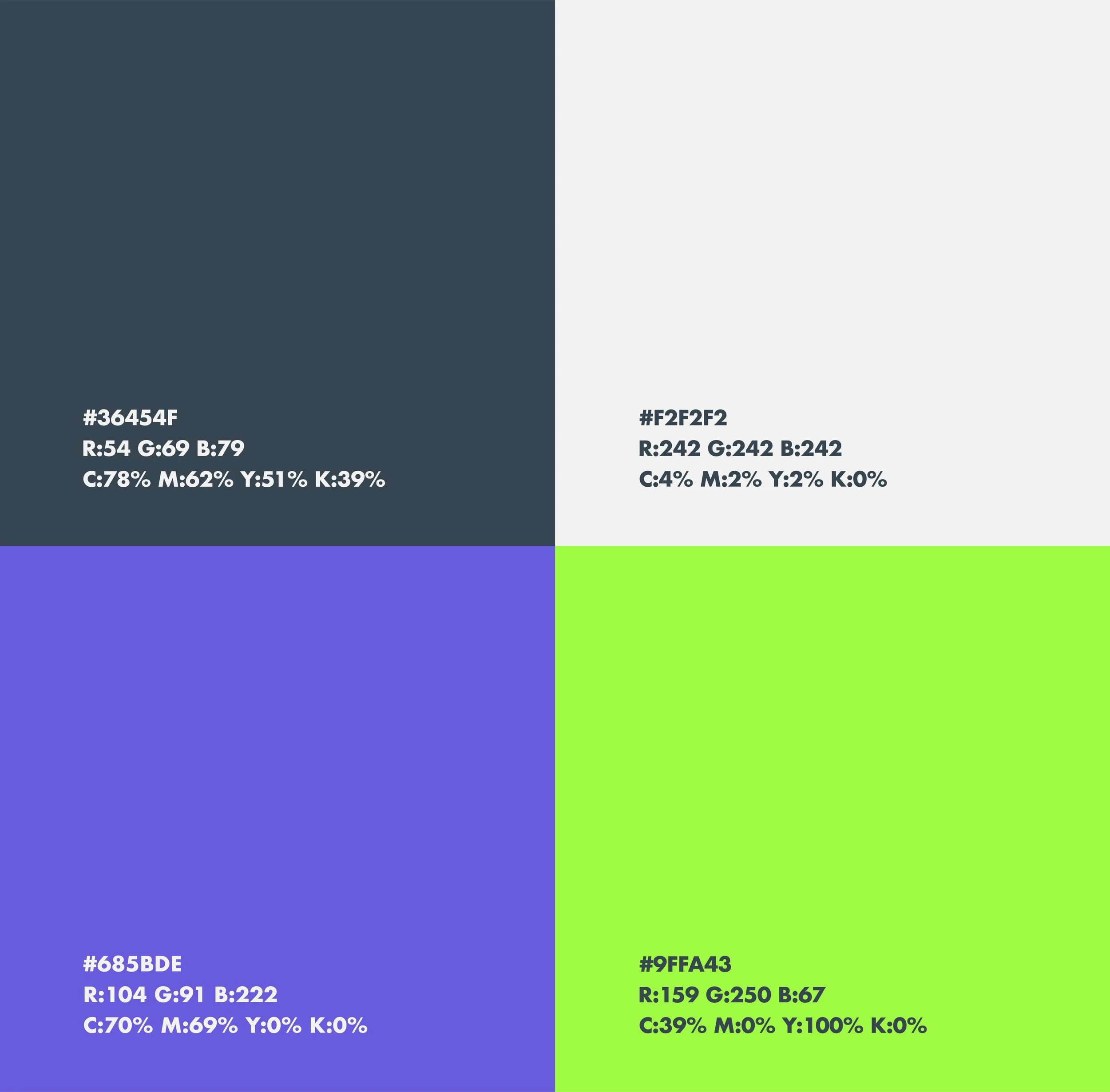
Color Palette No.1
A Dynamic Color Palette that Reflects Sportiveness
For the Play The Gym Brand Identity System, two distinct color palettes were developed—much like how sports teams use home and away uniforms. This dual approach allows the brand to adapt visually to different contexts while maintaining a cohesive identity.

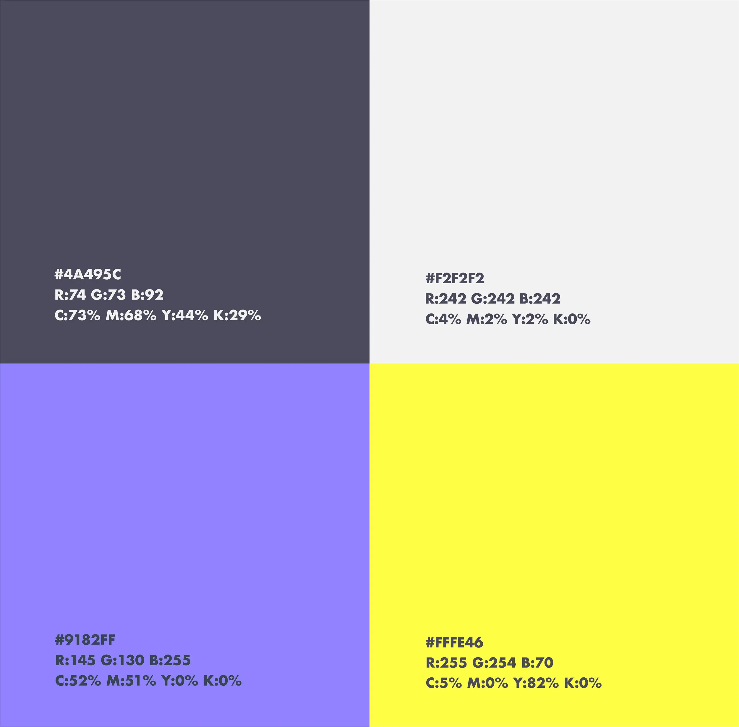
Color Palette No.2
An Alternative Color Palette that Refreshes the Identity While Maintaining Brand Recognition

Supporting Graphics No.1
Like with the Color Palette, two Color Ways Were Created for the Supporting Graphics in Order to Achieve the Ultimate Cohesion


Supporting Graphics No.2


© 2025 Amarillo Works. All rights reserved.