Behind every brand is a dream built from scratch — often far from home. These are the designs we crafted to honor that journey.
-
A brand born at the intersection of two cultures, shaped by migration, resilience, and care.
We designed the full brand identity and packaging system for this Ukrainian–Russian couple’s line of varenyky, honoring their roots while building a warm, approachable presence for the U.S. market.
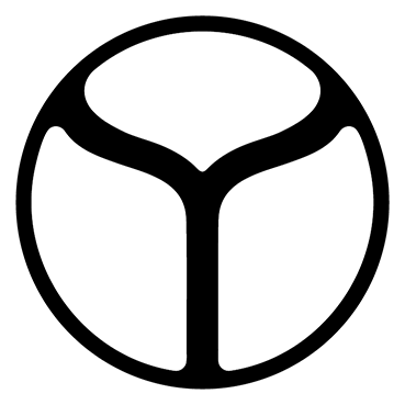
The logo incorporates a refined detail from the Ukrainian trident — a form that, when simplified, echoes a traditional baking tool still used in rural kitchens. As we explored visual directions, the symbol also evoked the mythical fern flower, a rare and powerful motif in Slavic folklore.
Six packaging variations were crafted to highlight each flavor, blending bold colors with clarity and heart.
-
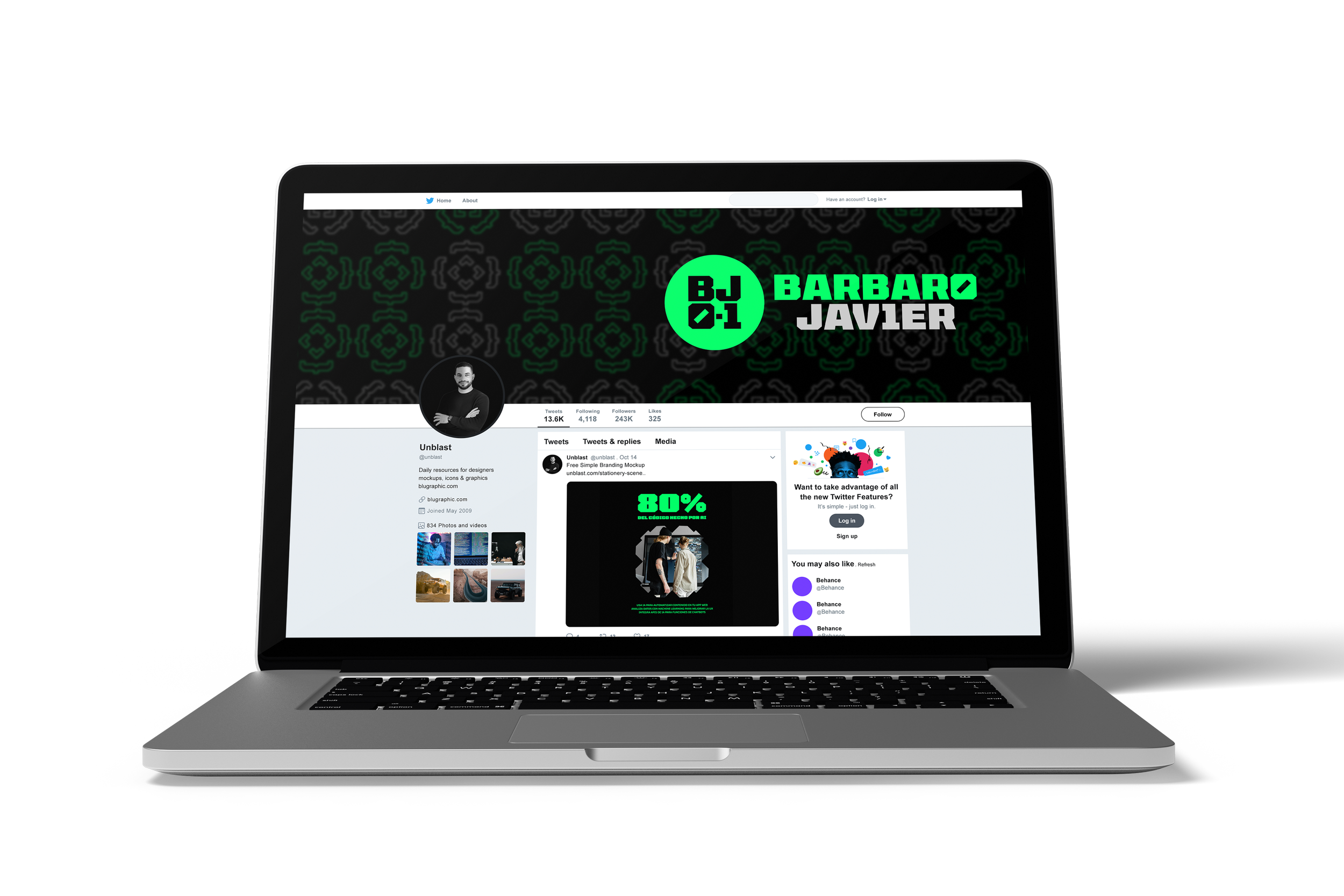
A Cuban developer based in Dubai, Barbaro needed more than just a logo — he needed a full personal brand to build credibility and lead others toward the same path of opportunity he carved out for himself.
We started by designing a brand identity rooted in his passions: the binary code that shapes his profession and the rugged spirit of the Bronco, a vehicle he came to love in the Arabian desert. From there, we crafted a full content system — including newsletter templates, social media assets, Facebook banners, and even content pillars — to help him share his story and guide others with clarity and impact.
-
We developed this brand identity for a pressure washing and car detailing business that wanted to look as clean and bold as the service they provide.
The logotype draws inspiration from the high-pressure water jet — the core of their work — with horizontal lines that suggest speed, power, and precision.
It’s a brand designed to feel as crisp and reliable as a freshly detailed car, with a visual language that signals trust, strength, and spotless results.
-
This brand identity was created for a nonprofit supporting children with Phenylketonuria (PKU), a rare hereditary condition that requires strict dietary care.
The brand mark merges two powerful symbols: a heart, representing love and care, and a fig, often called the “fruit of the miracle” for its deep associations with healing and nourishment.
The result is a unique form built on axial geometry — strong, versatile, and clear even at the smallest scales.
As part of this collaboration, we also designed some brand applications like tote bags and mugs, helping the organization spread awareness with warmth and cohesion across touchpoints.
-
Brand identity for a community-focused gym that trains bodies and minds without machines.
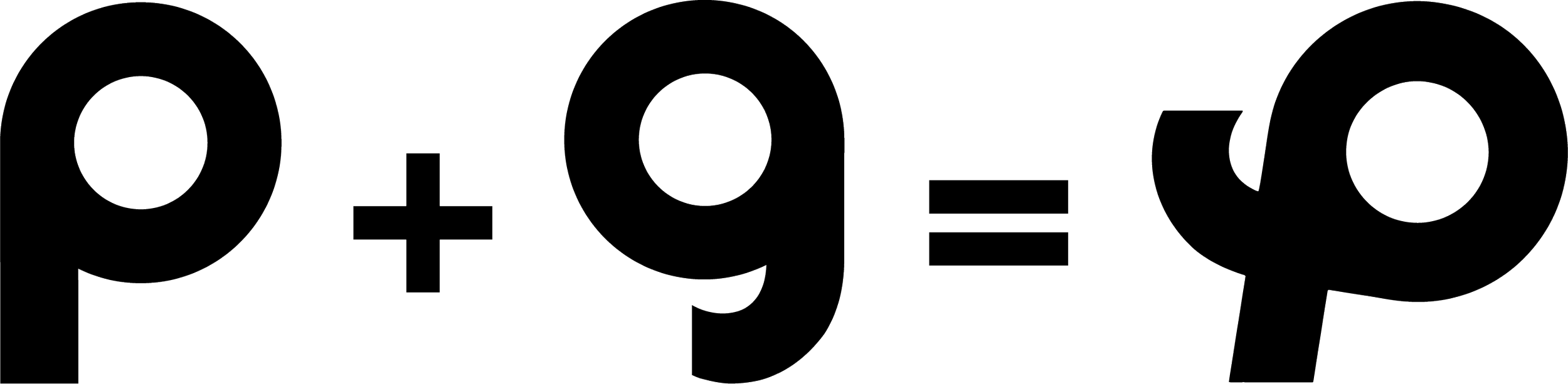
We designed a dynamic visual system rooted in movement, strength, and simplicity. The logo fuses the initials P and G into one fluid mark, evoking motion and clarity — a perfect fit for a space built around bodyweight training and real human connection.
To reflect the brand’s dual energy — calm focus and vibrant drive — we developed two color versions of the full identity, including a custom pattern applied across uniforms, space, and digital touchpoints.
We also created social media templates to support the gym’s launch and help the founder share his vision online.
-
We created this brand identity for a cabinetry company rooted in craftsmanship and clarity. The monogram draws from the cube — the fundamental shape behind every cabinet — and translates it into clean, confident lines.
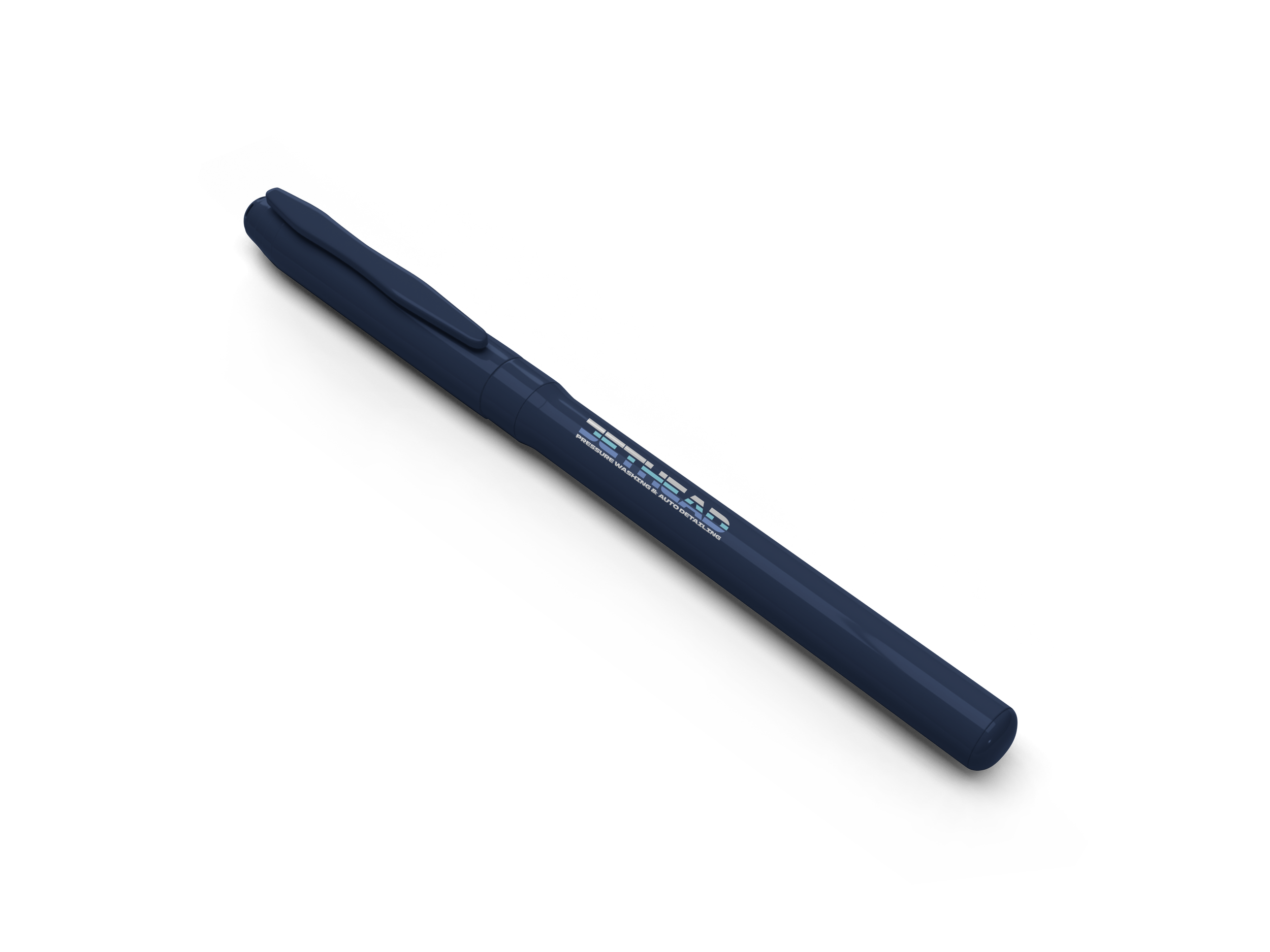
The logo lives at the intersection of structure and elegance, and was applied across business cards, pens, and a striking vehicle wrap designed to stand out in the streets of Miami.
Among several strong design directions, the client chose the one that best conveyed their precision and practical artistry — a visual identity built to reflect the beauty of functional design.
-
Visual identity for an electronic music artist crafting sound with intention.
This identity is all about rhythm and resonance. We created a minimalist logo that echoes the tactile world of equalizers and knobs — the language of DJs. The sequence of dots isn’t just a form: it’s a metaphor for movement, sound, and the artist’s signature beat.
The visual system includes a motion version of the logo that simulates live mixing, plus brand applications like sweatshirts and hats to help Leunam Wave take their brand beyond the stage.
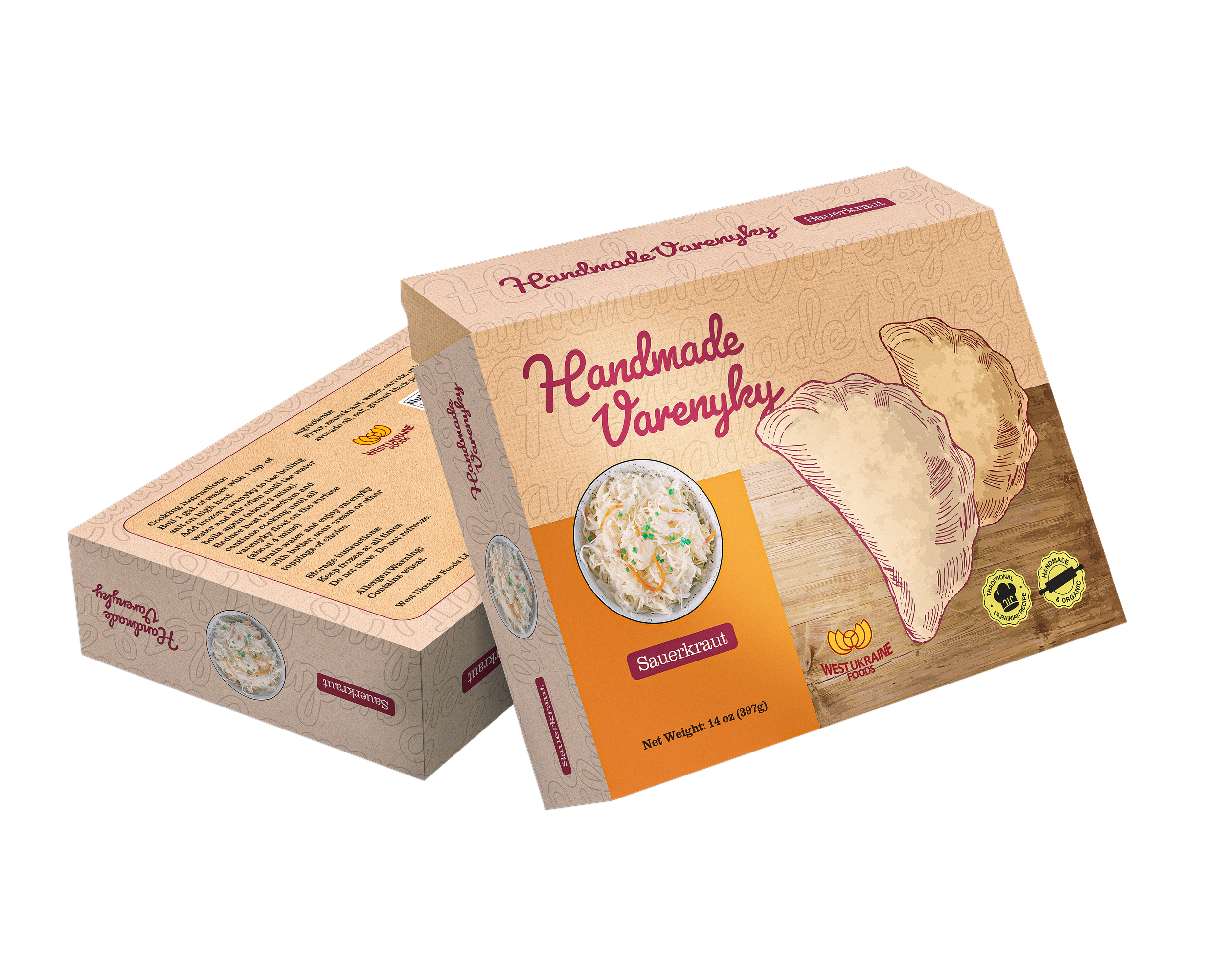
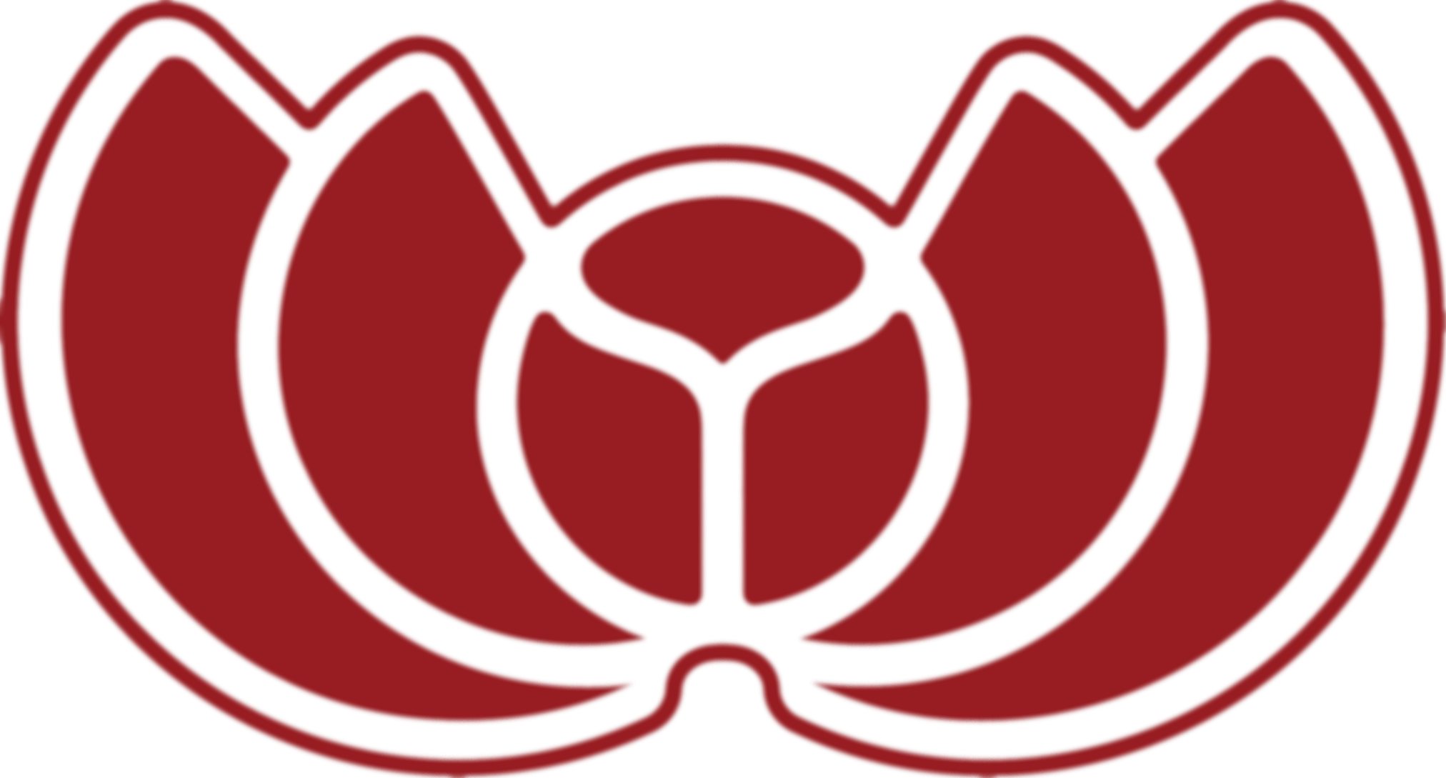
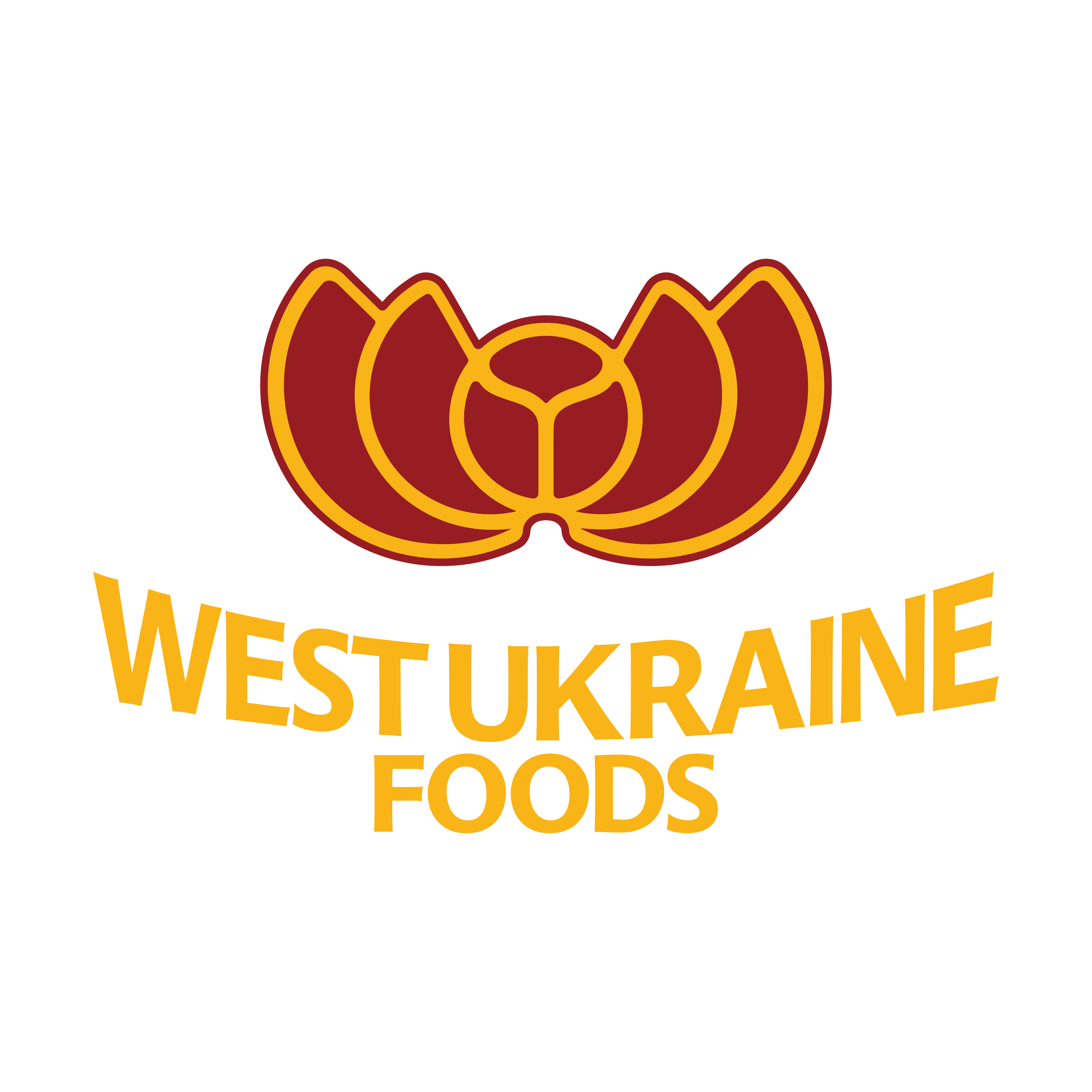
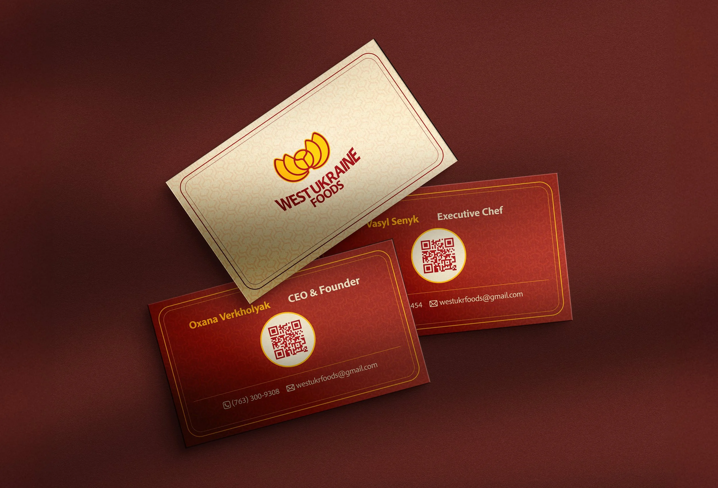
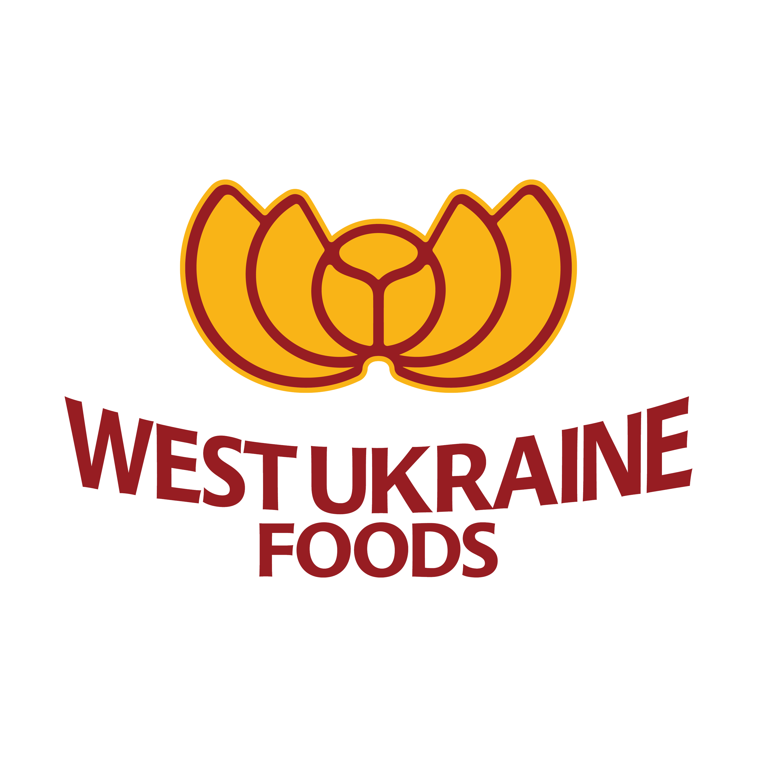
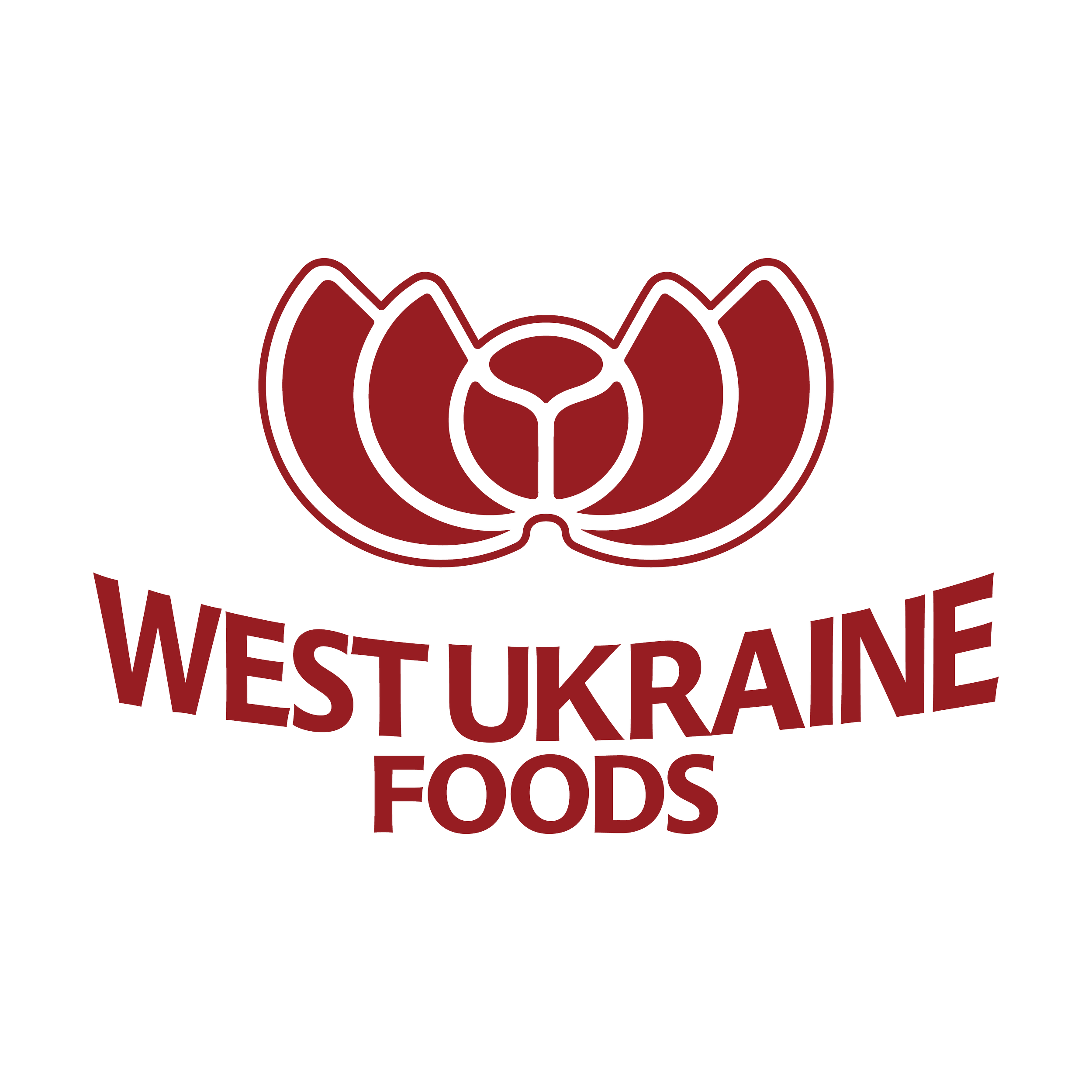
West Ukraine Food
Brand Identity Design System

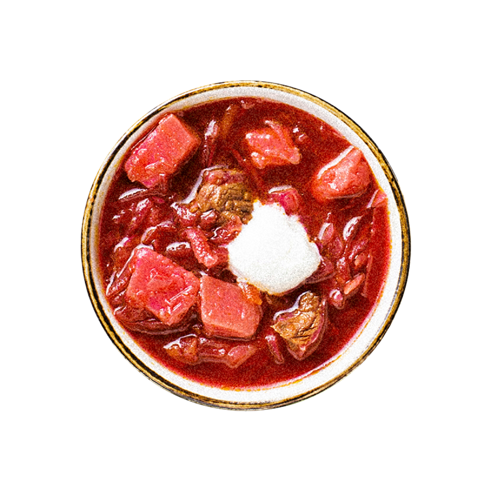
Rooted in care, tradition, and nourishment, West Ukraine Foods invites connection through every detail. Because food made by hand deserves design made with heart.
Design Criteria
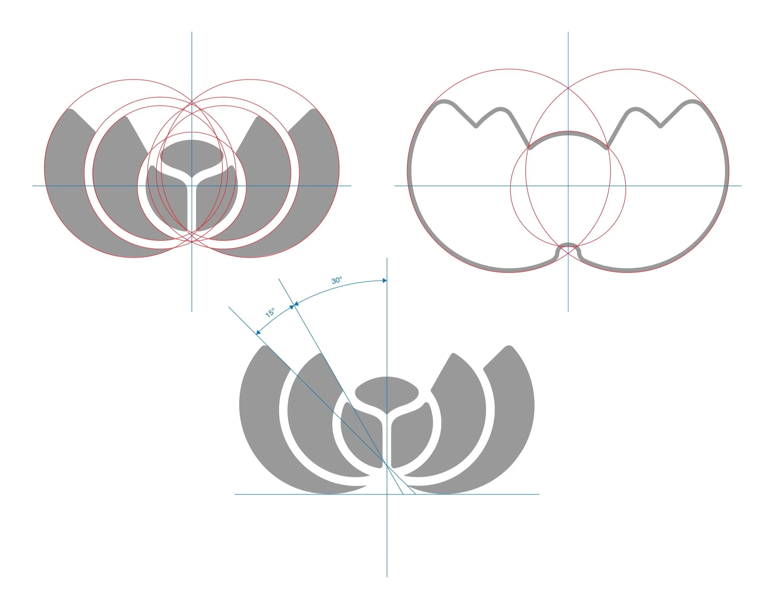
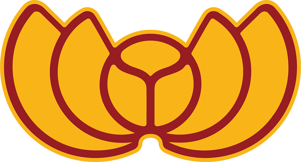
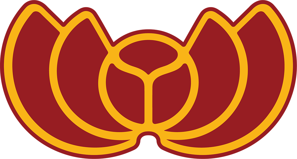
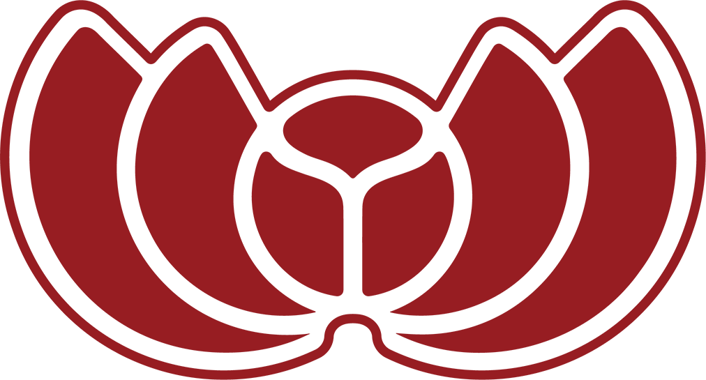
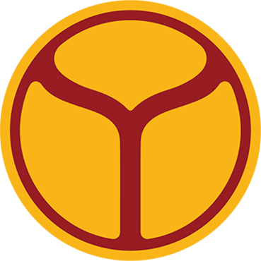
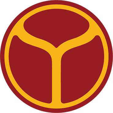
The brand for West Ukraine Foods merges cultural identity with culinary symbolism. At its core lies a fragment of the Ukrainian coat of arms, a national emblem reinterpreted to highlight pride and origin.
Surrounding it are stylized shapes inspired by varenyky, a beloved traditional dish, arranged in a protective and embracing composition. This visual structure reflects the brand’s commitment to family, heritage, and authenticity.
Shapes that make sense
The symbol’s form conveys a sense of care, creativity, and attention to detail values, that define the way West Ukraine Foods approaches each product. The brand not only serves as a cultural ambassador, but also as a visual representation of craftsmanship and devotion to quality.

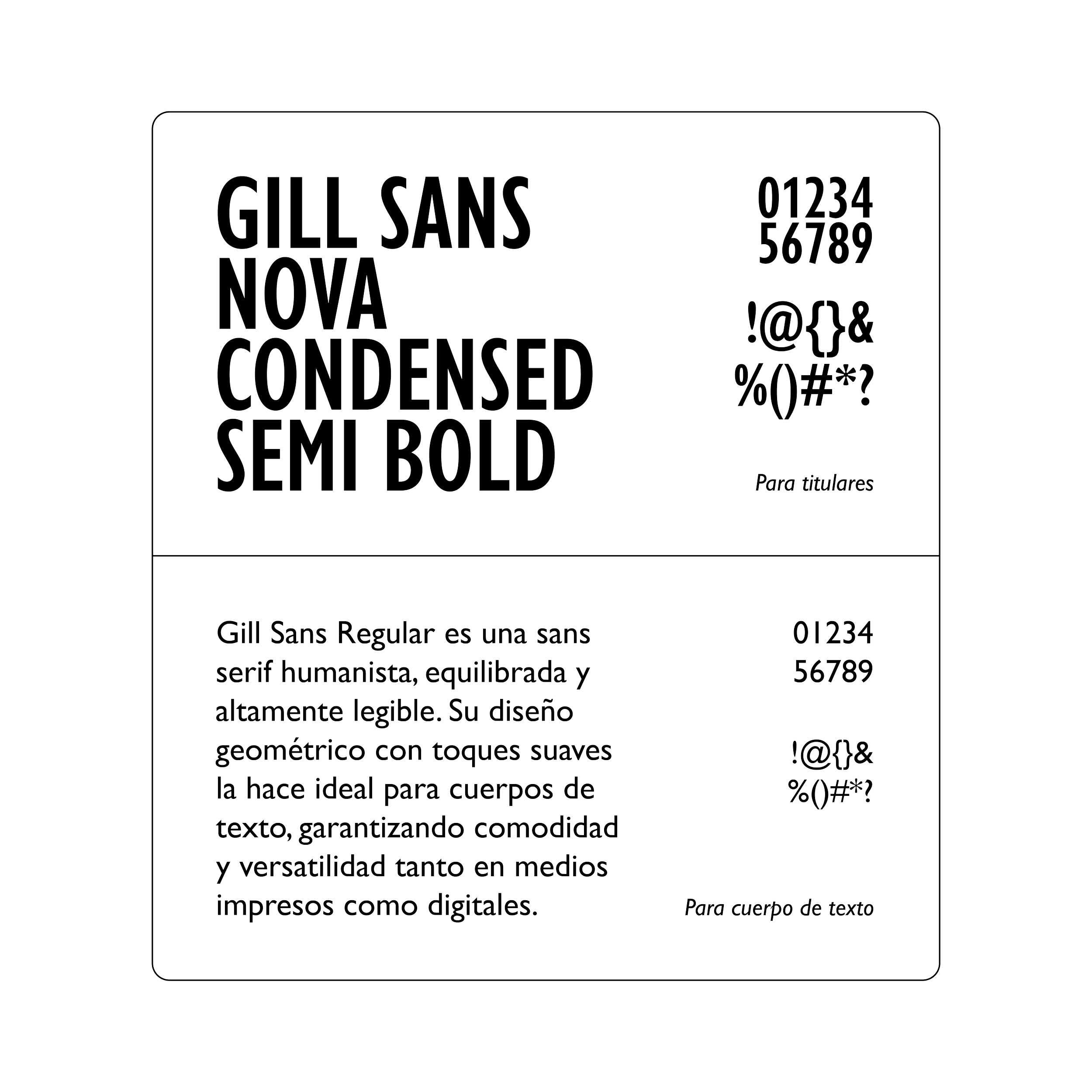
Typography Selection
The right typography helps the brand to convey its communications while enhancing brand recognition.

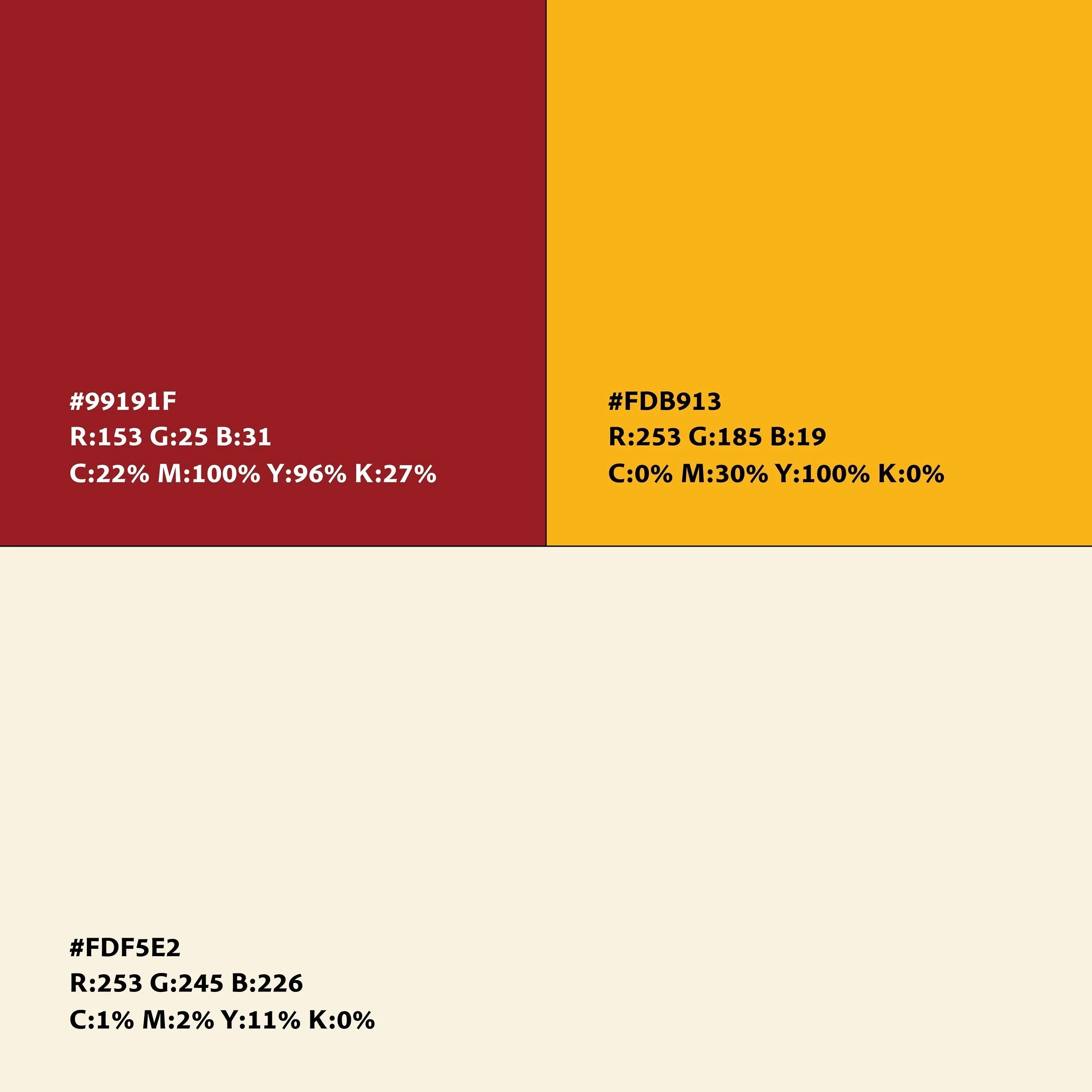
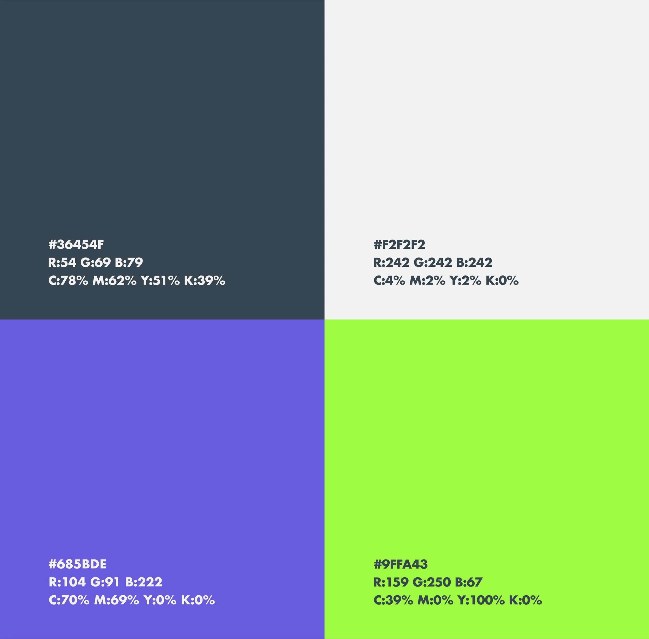
The Color Palette


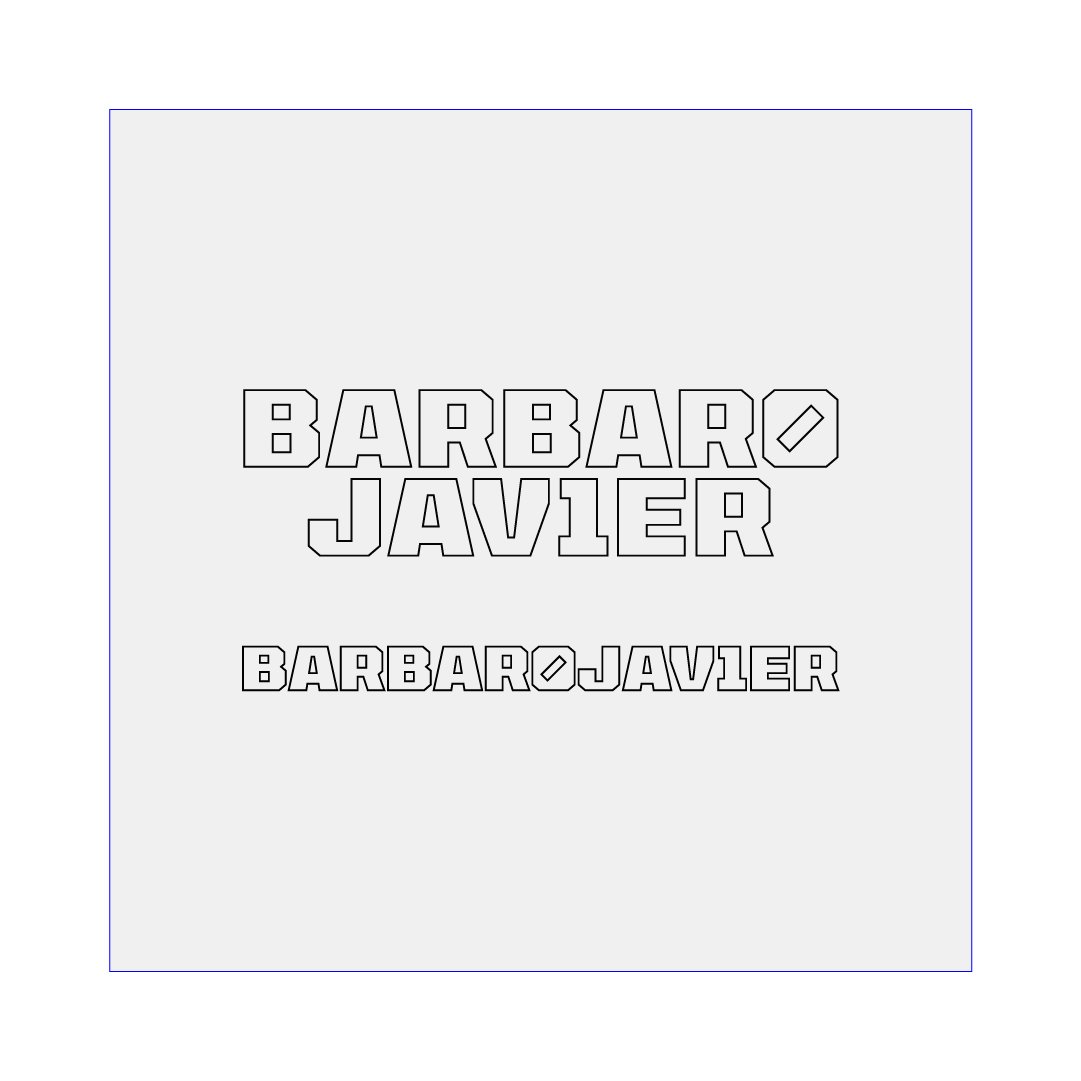
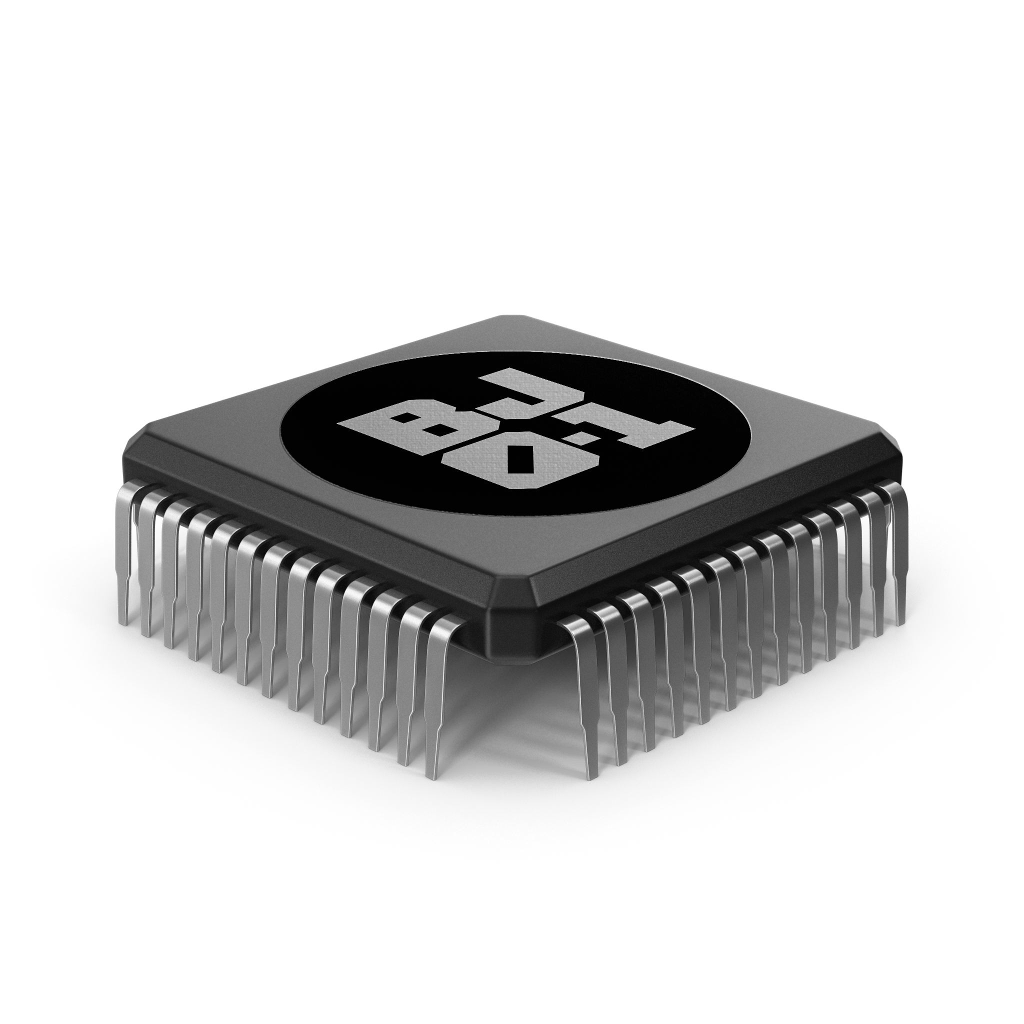
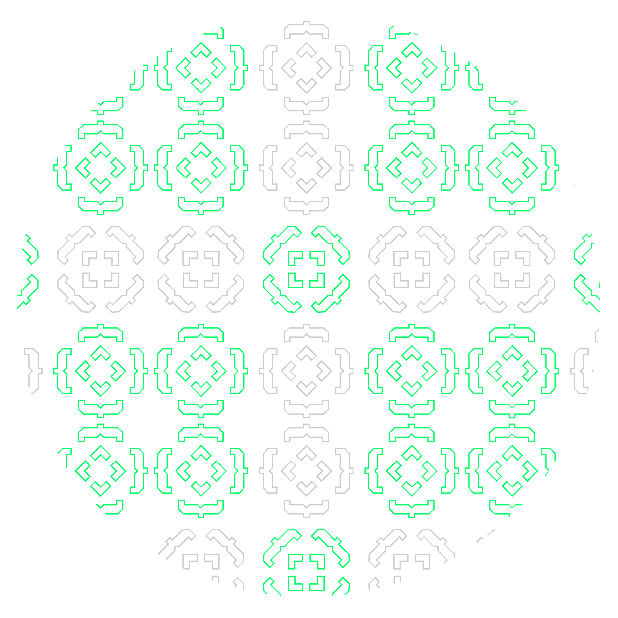
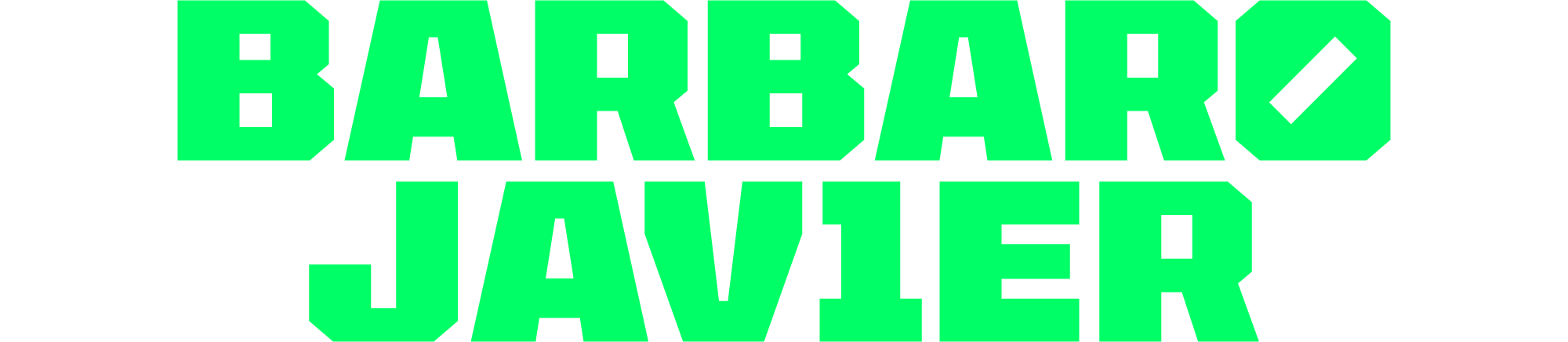
Barbaro Javier
Brand Identity System for a Web Developer
In order to craft this personal brand for a Developer living and working from Dubai, we had to dive into his passions, motivations and lifestyle.
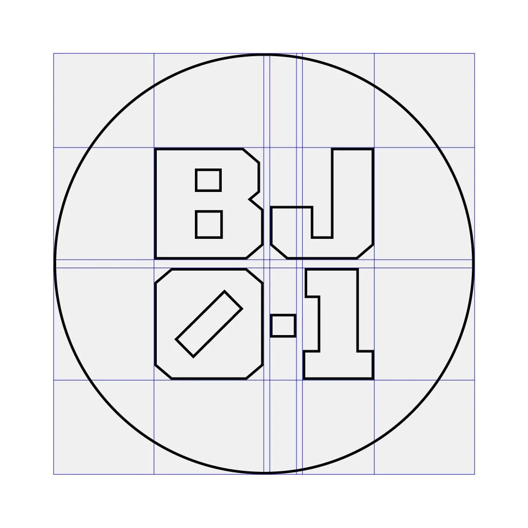
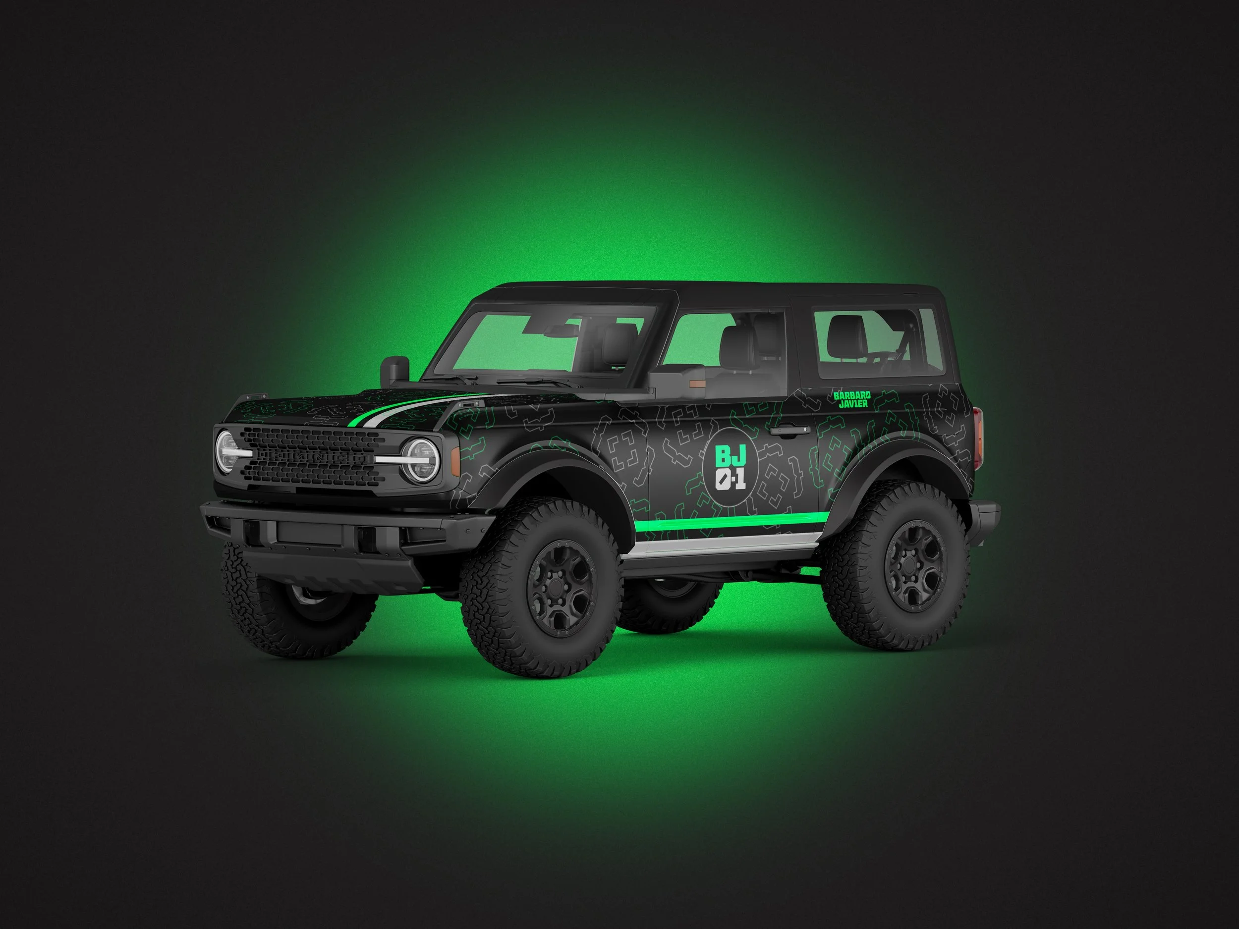
The Logo for Barbaro Javier draws inspiration from the binary system used in computer code, and the strong letterforms found in the Bronco off-road vehicle. A passion that he discovered in the dunes of the Arabian country.

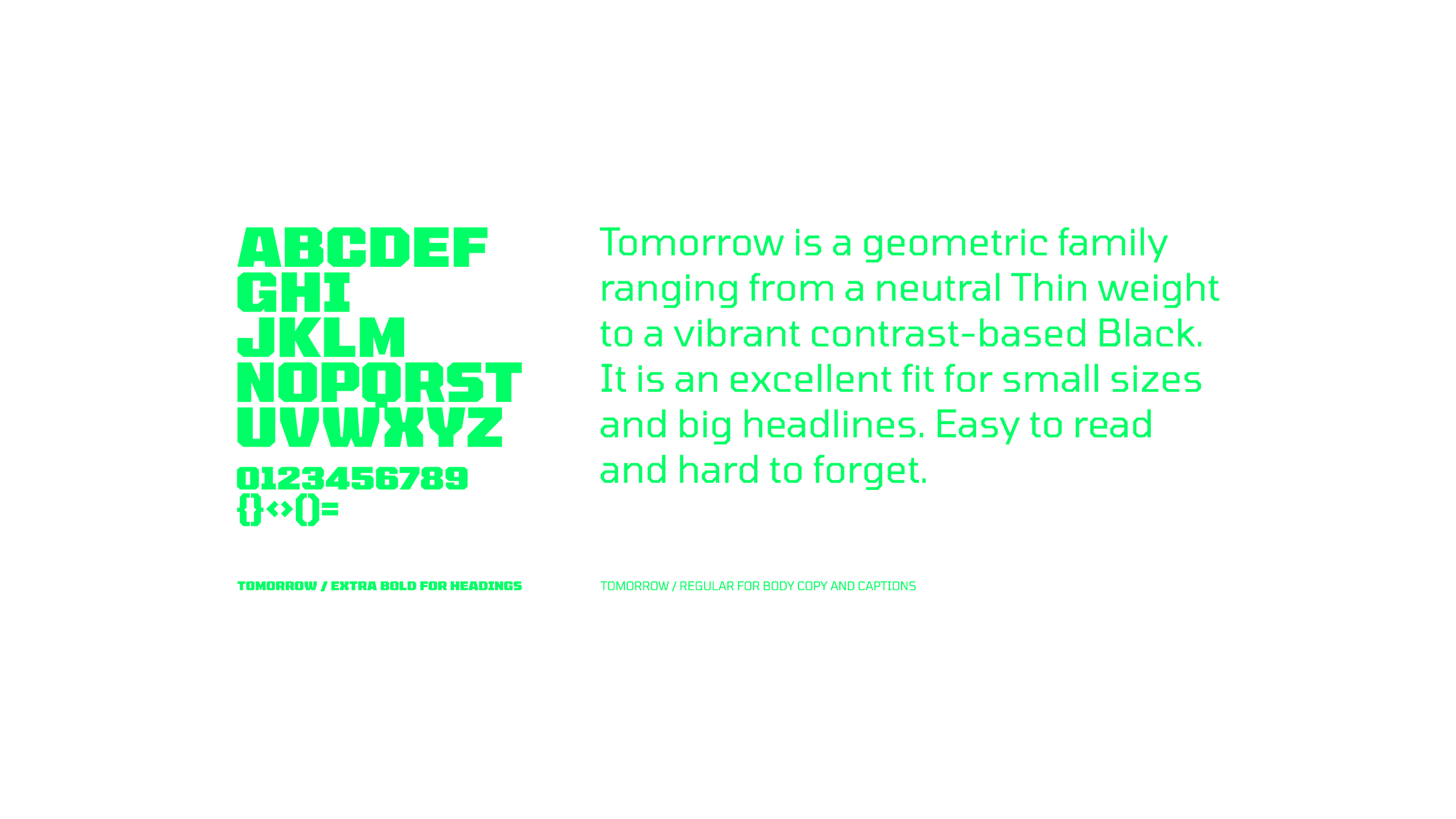
Typography Selection

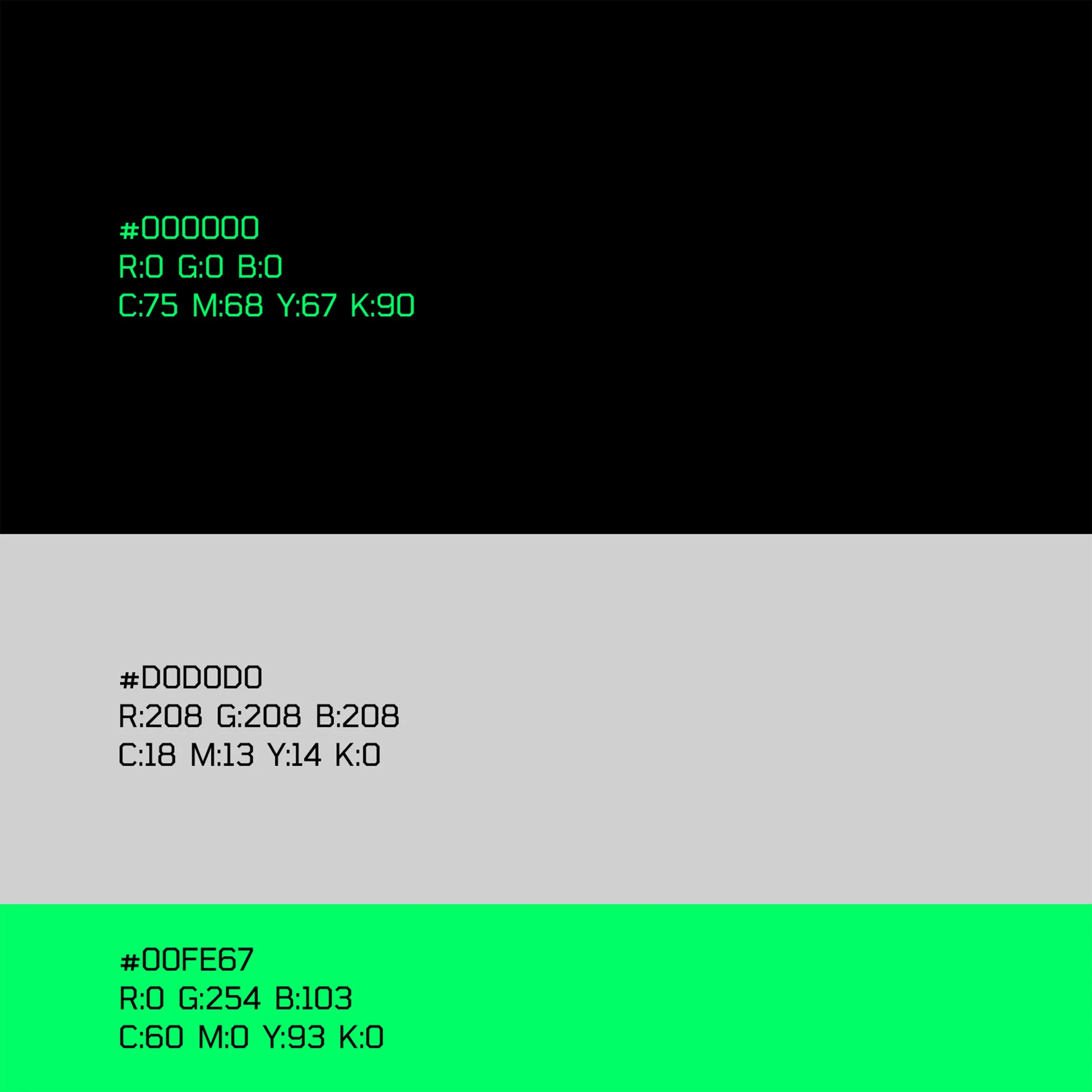
A Tech Related Color Palette
A Brand That Lives in Two Worlds, Digital and Material


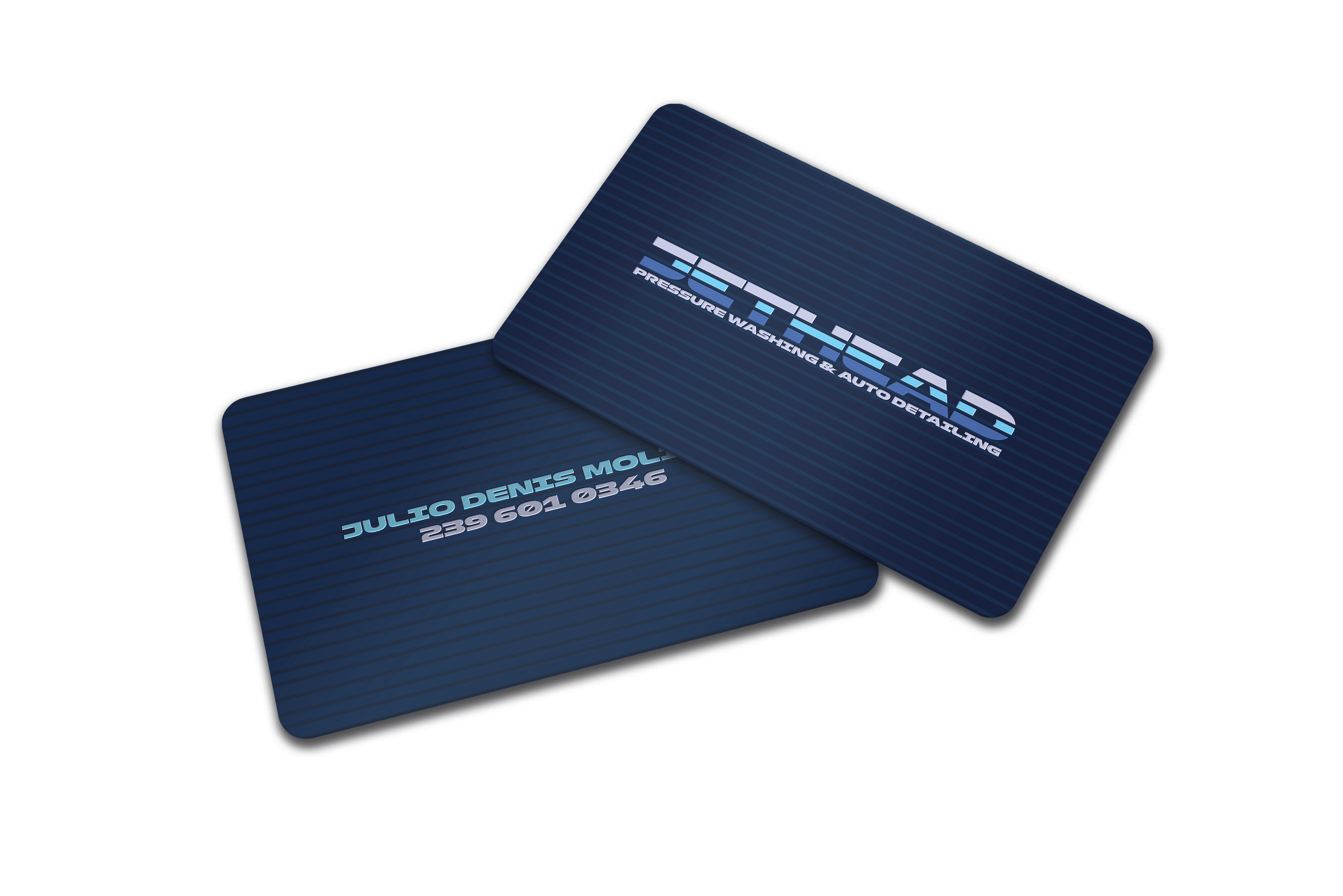
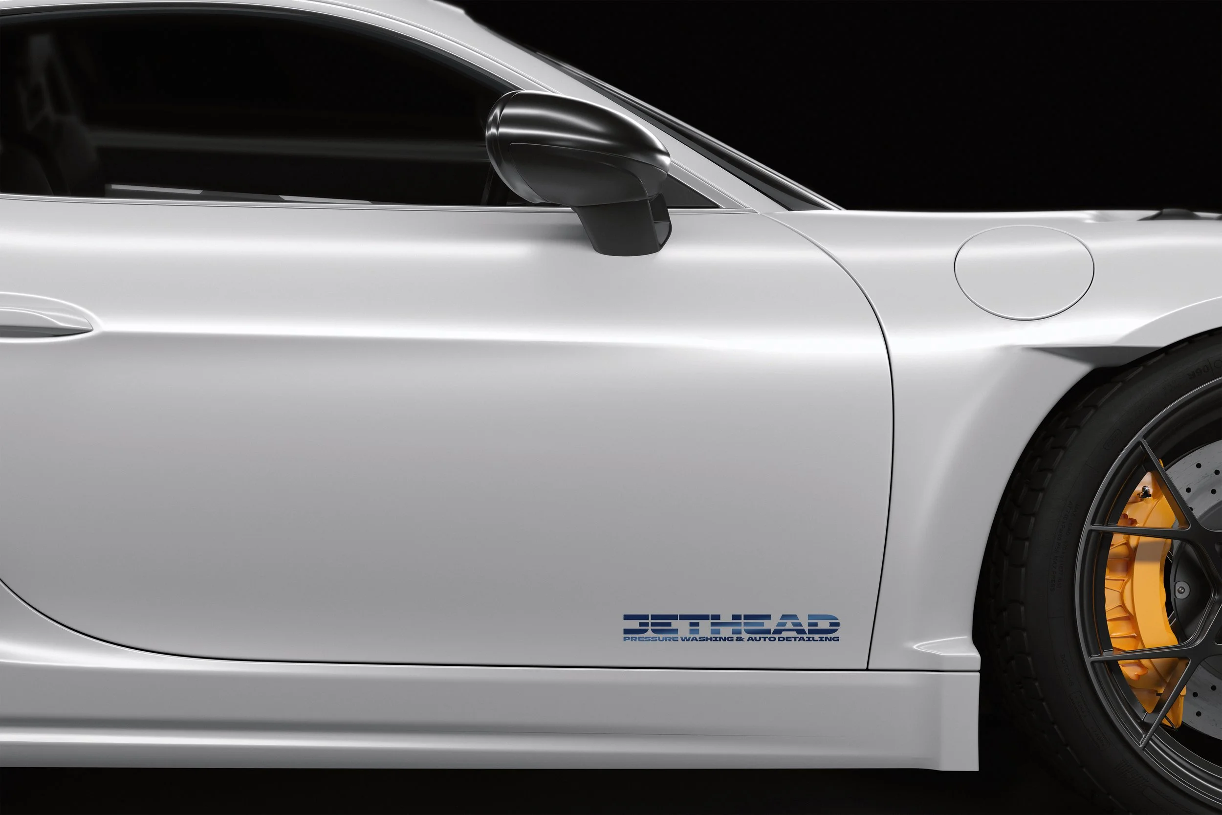
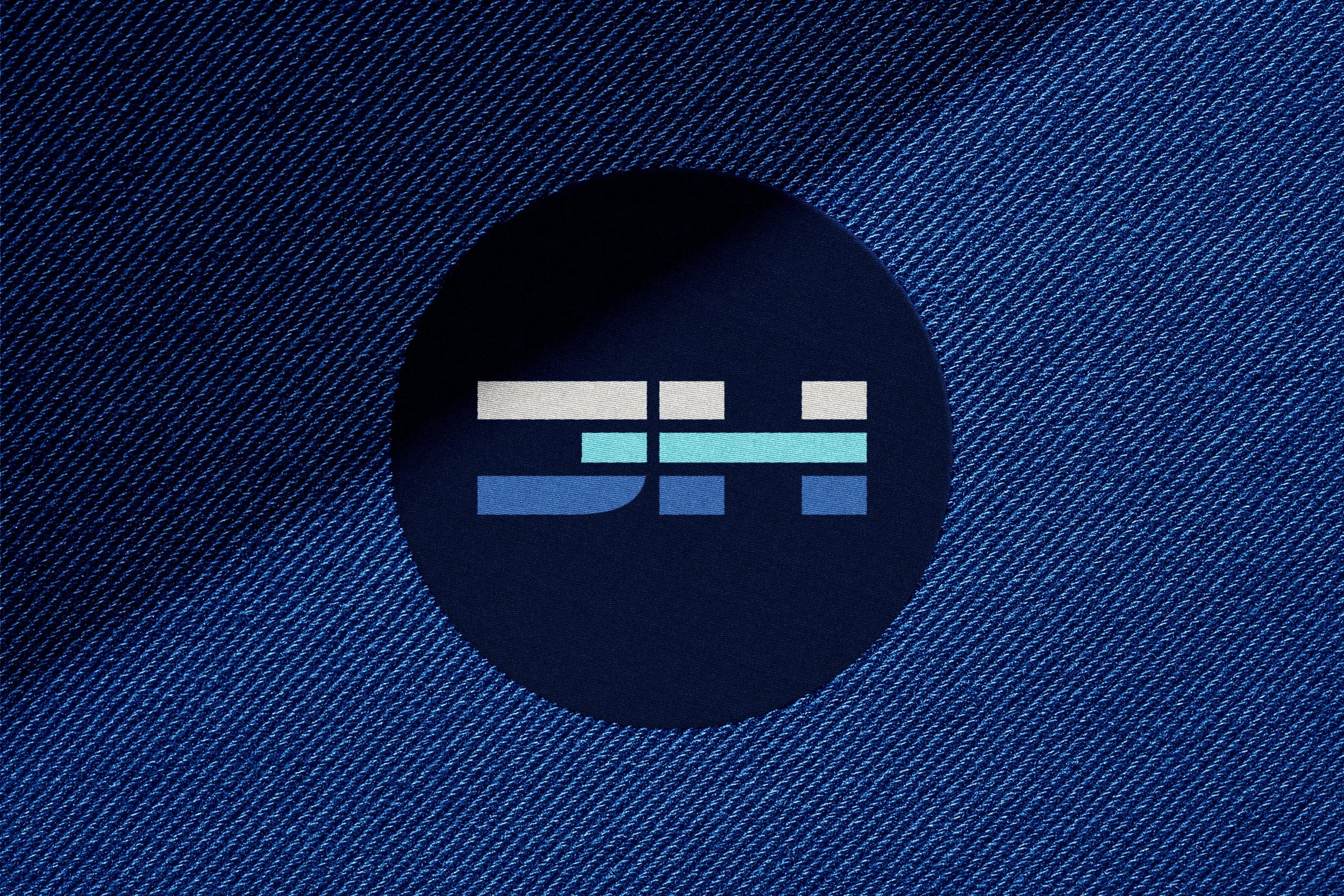
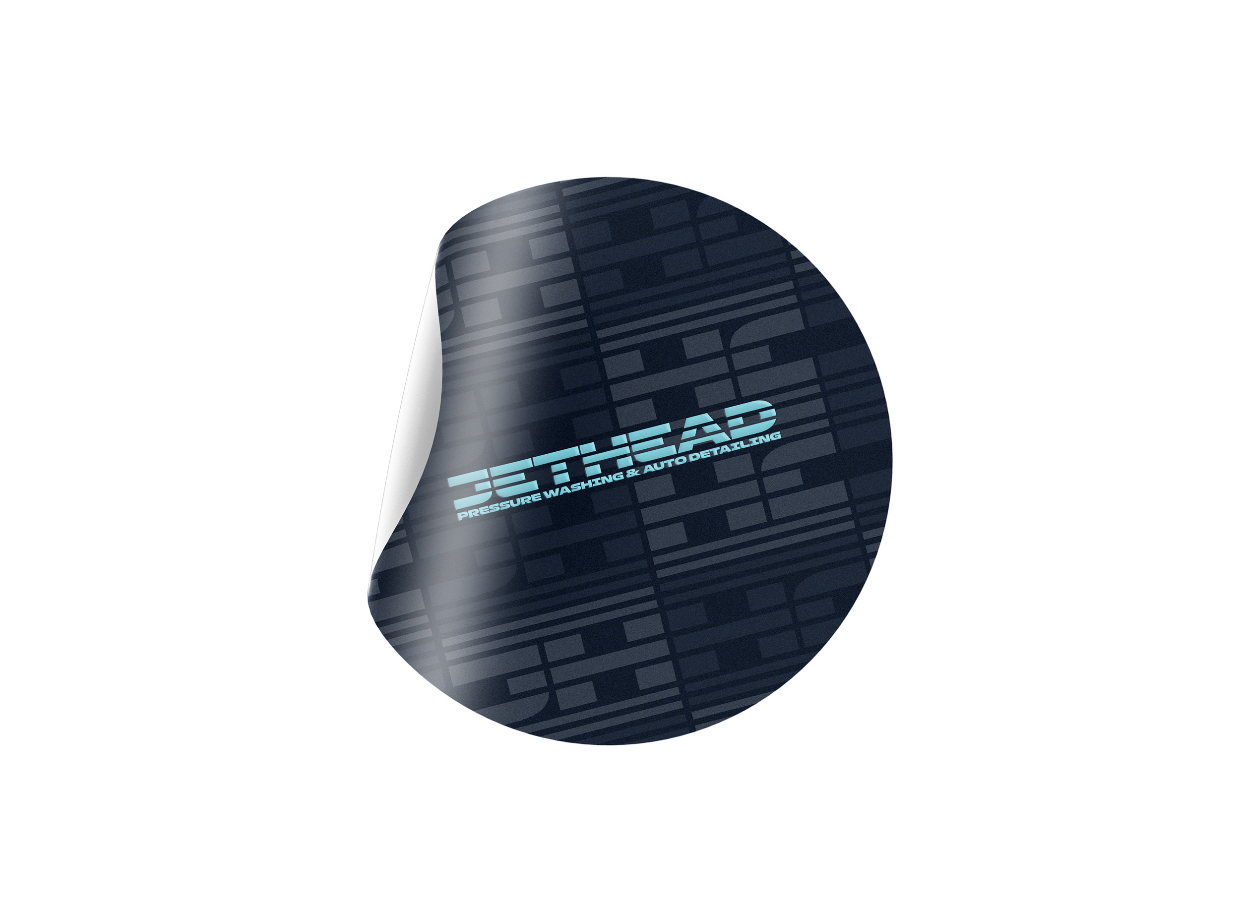
Brand for a Car Wash and Pressure Cleaning Company
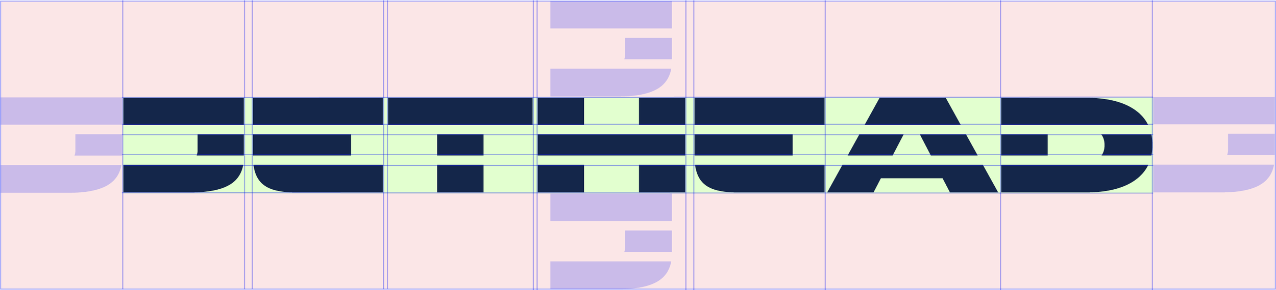
The Jethead logotype captures the essence of a high pressure water jet, the core tool used in pressure washing and auto detailing.
The horizontal lines in the logo evoke the forceful, controlled blast of water that cuts through dirt and grime, symbolizing the brand’s focus on precision and efficiency.
This visual element reflects the commitment to providing powerful, thorough cleaning services that restore and protect, whether for your home or vehicle.

Main Logotype
The Brand Optimized
for Horizontal Applications
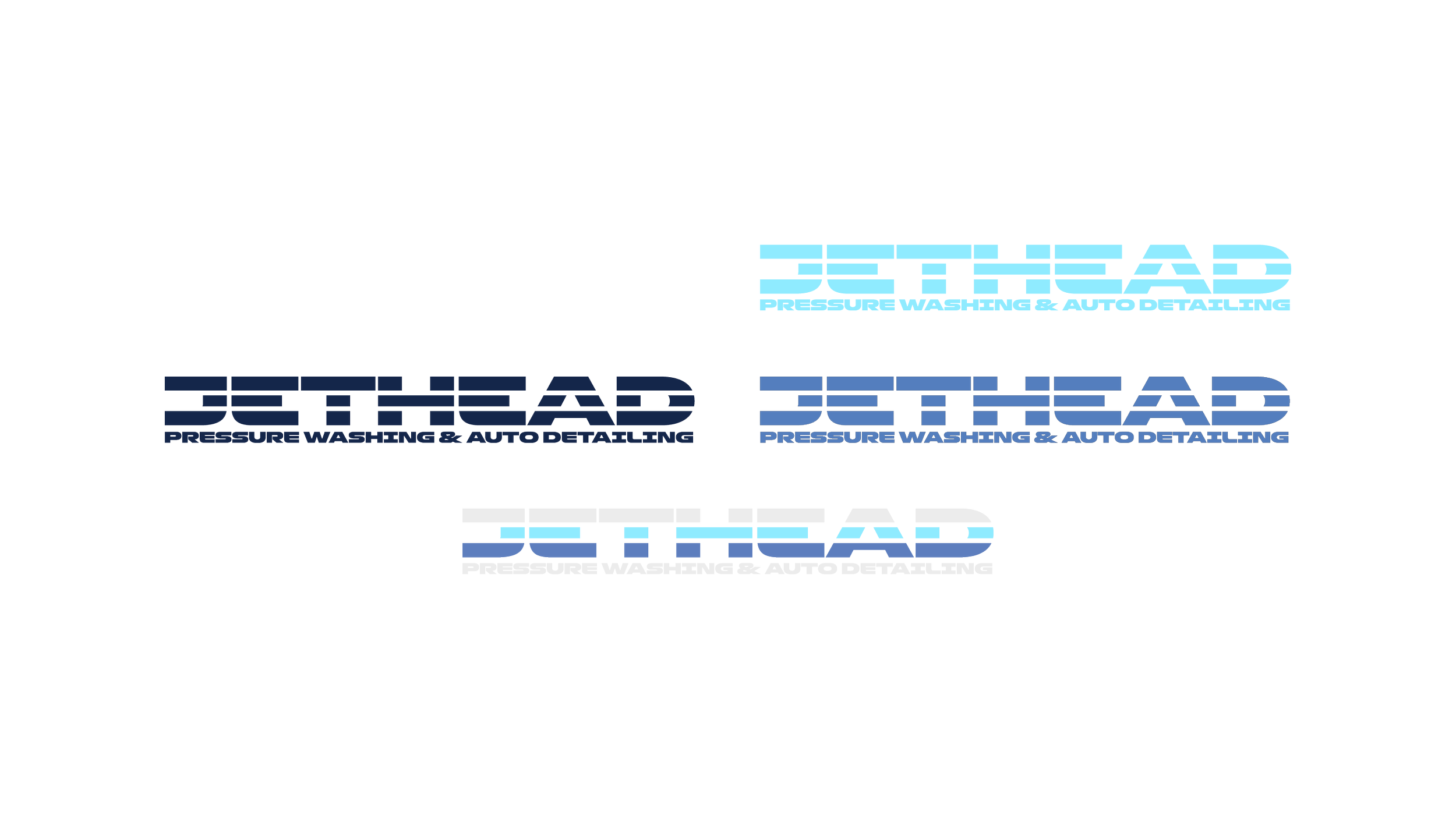
Responsive Brand Variation
The Brand Optimized
for Restricted Space Usage

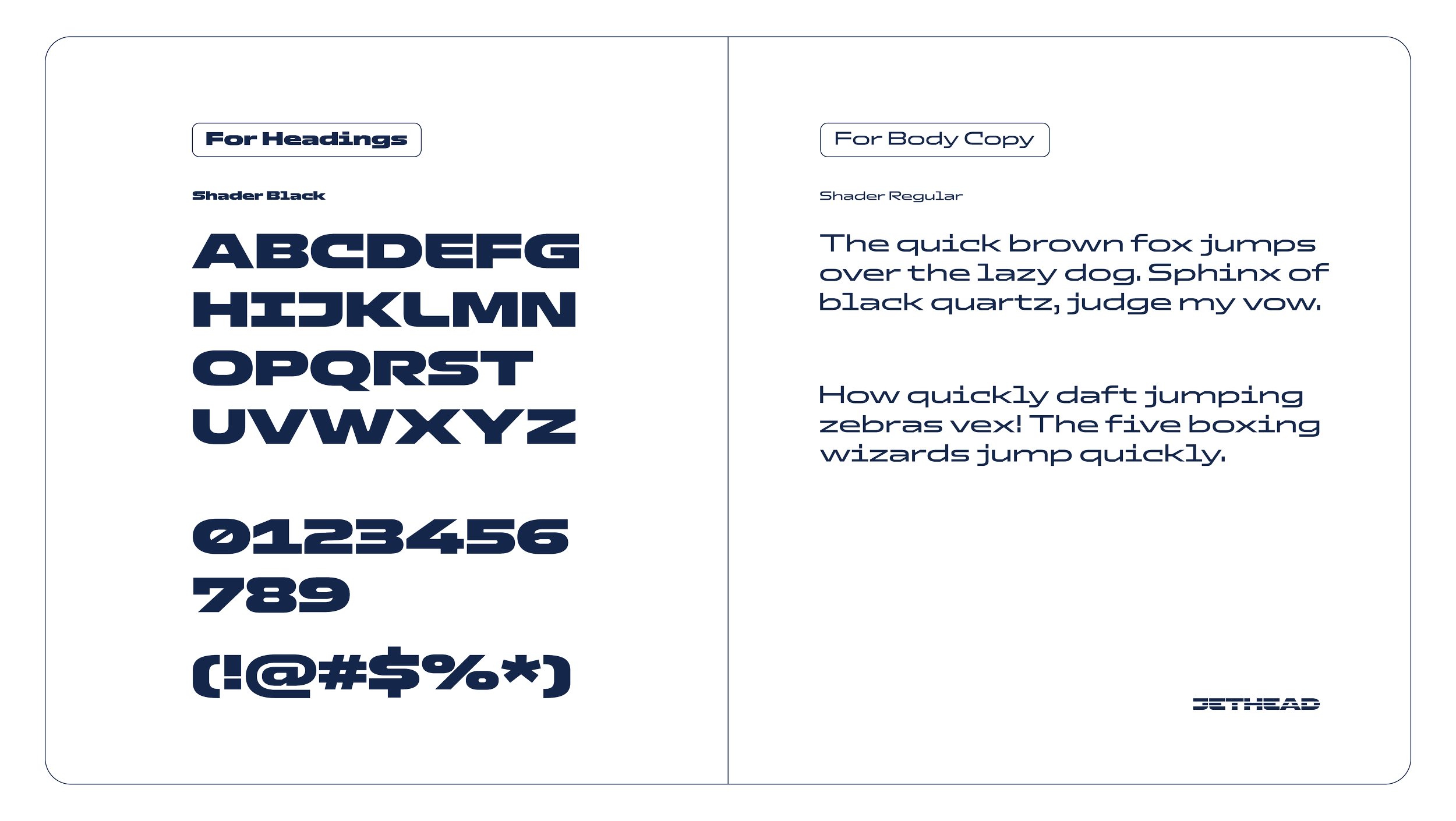
Typography Selection

Colors that Suggest Cleanliness


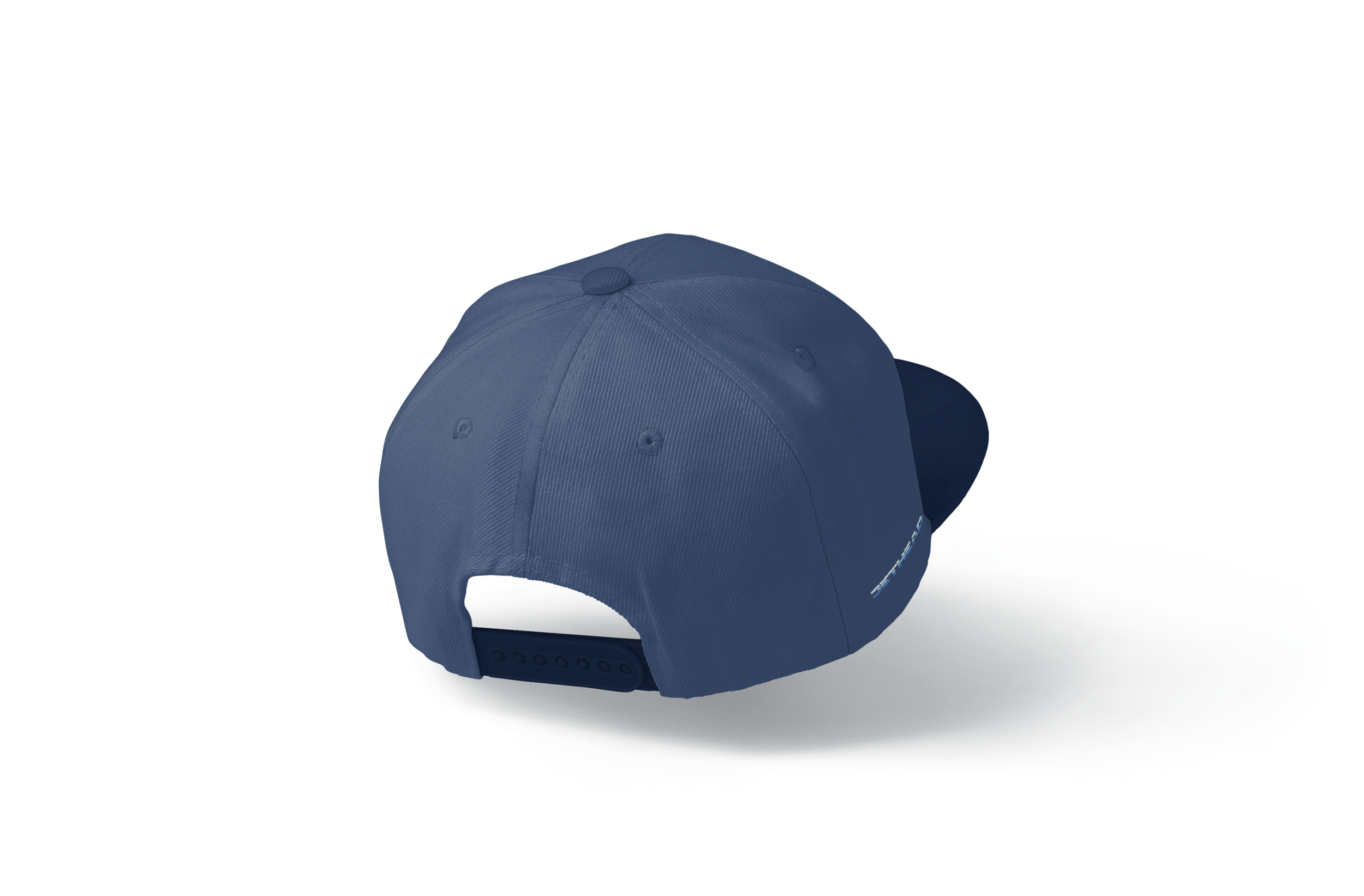
Brand Applications


© Copyright 2025 Amarillo Works


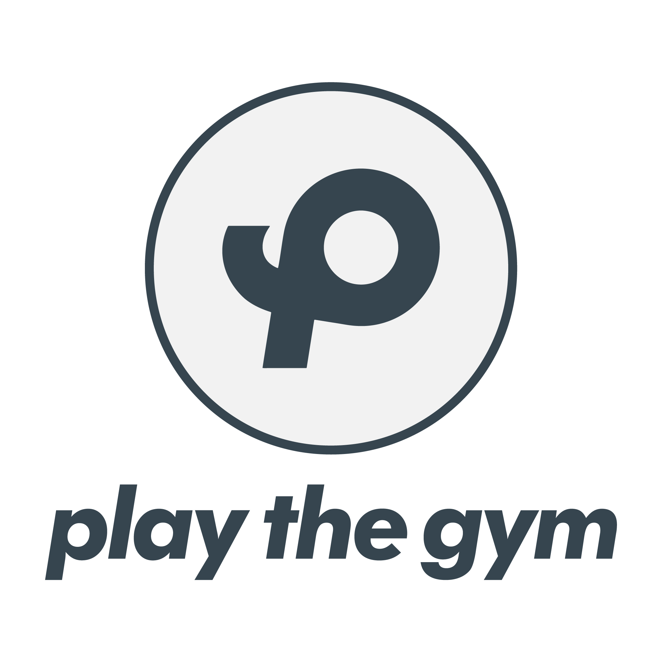
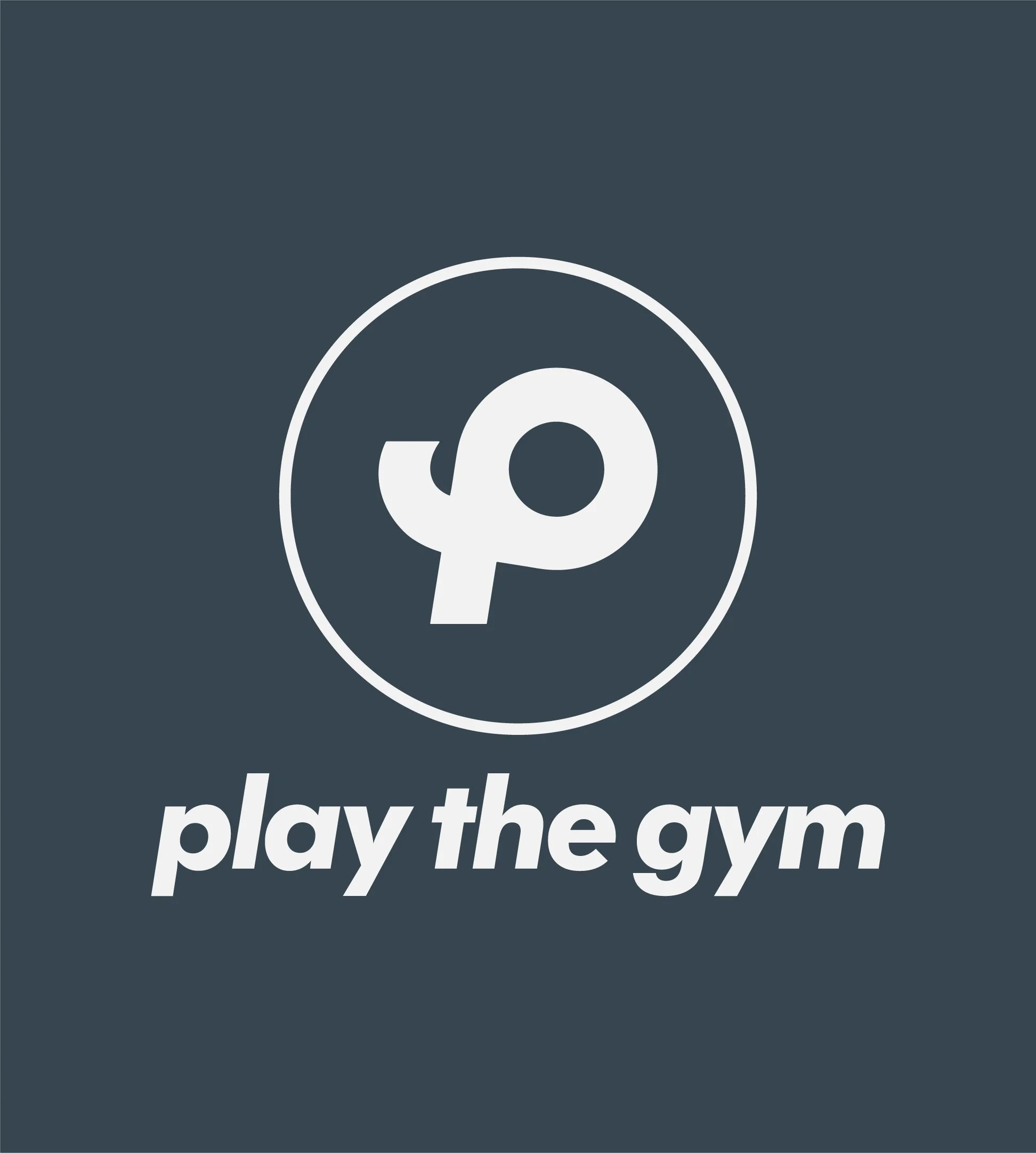
Brand for an Outstanding Gym
The design of the Play The Gym brand mark revolves around the union of the “P” and “G,” the brand’s initials, which come together to form a third shape. This new shape is not just an abstract symbol but one that reflects the dynamic movement of an athlete in action.
By combining these letters, the symbol subtly captures the energy and fluidity of physical movement, embodying the brand’s core message of making fitness engaging and active.
This approach ensures that the brandmark is more than just a visual identifier—it becomes a representation of the strength, motion, and vitality that define PlayTheGym.
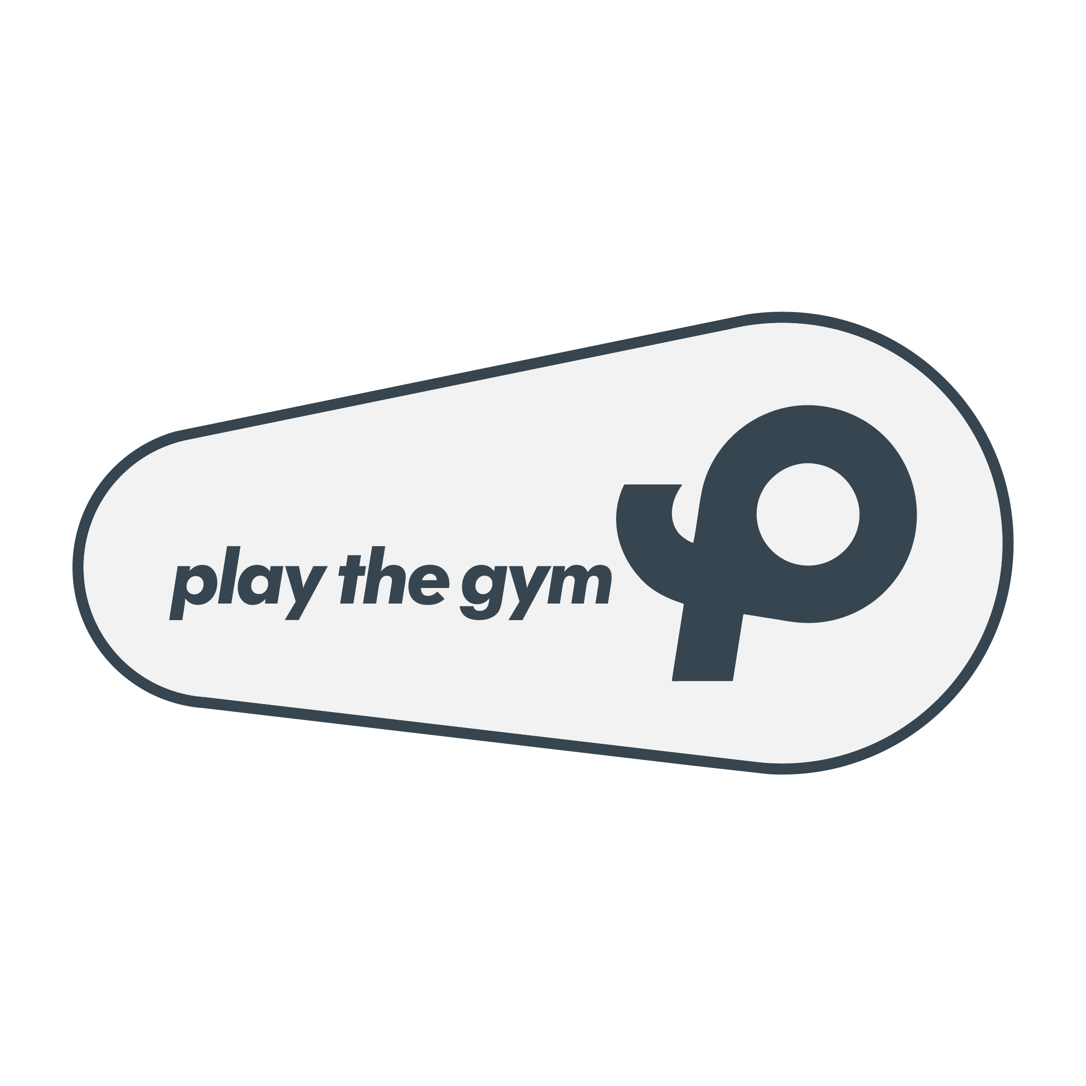
Stacked Circular Brand Lockup
Horizontal Brand Lockup


Typography Selection


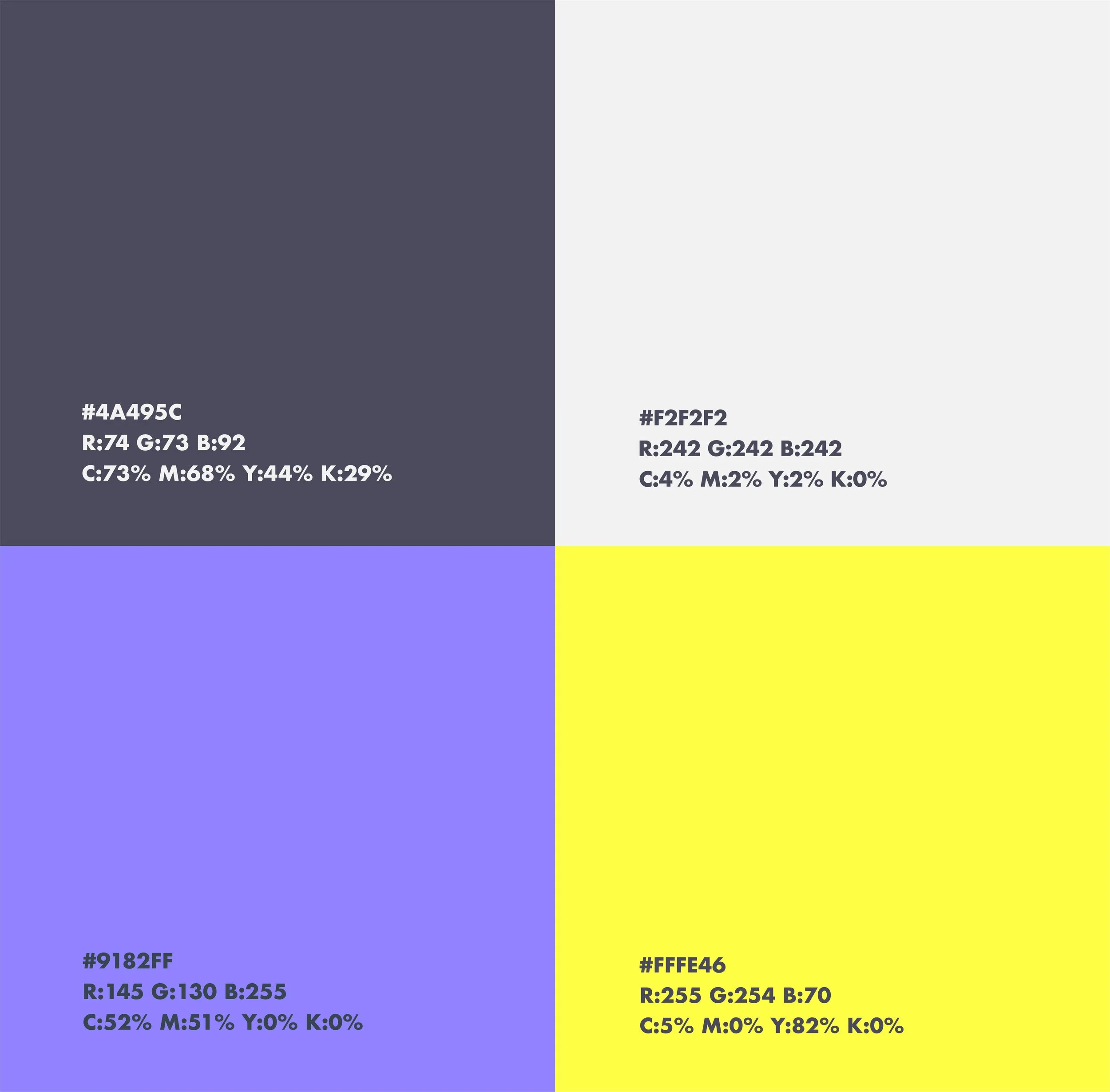
Color Palette No.1
A Dynamic Color Palette that Reflects Sportiveness
For the Play The Gym Brand Identity System, two distinct color palettes were developed—much like how sports teams use home and away uniforms. This dual approach allows the brand to adapt visually to different contexts while maintaining a cohesive identity.

Color Palette No.2
An Alternative Color Palette that Refreshes the Identity While Maintaining Brand Recognition

Supporting Graphics No.1
Like with the Color Palette, two Color Ways Were Created for the Supporting Graphics in Order to Achieve the Ultimate Cohesion
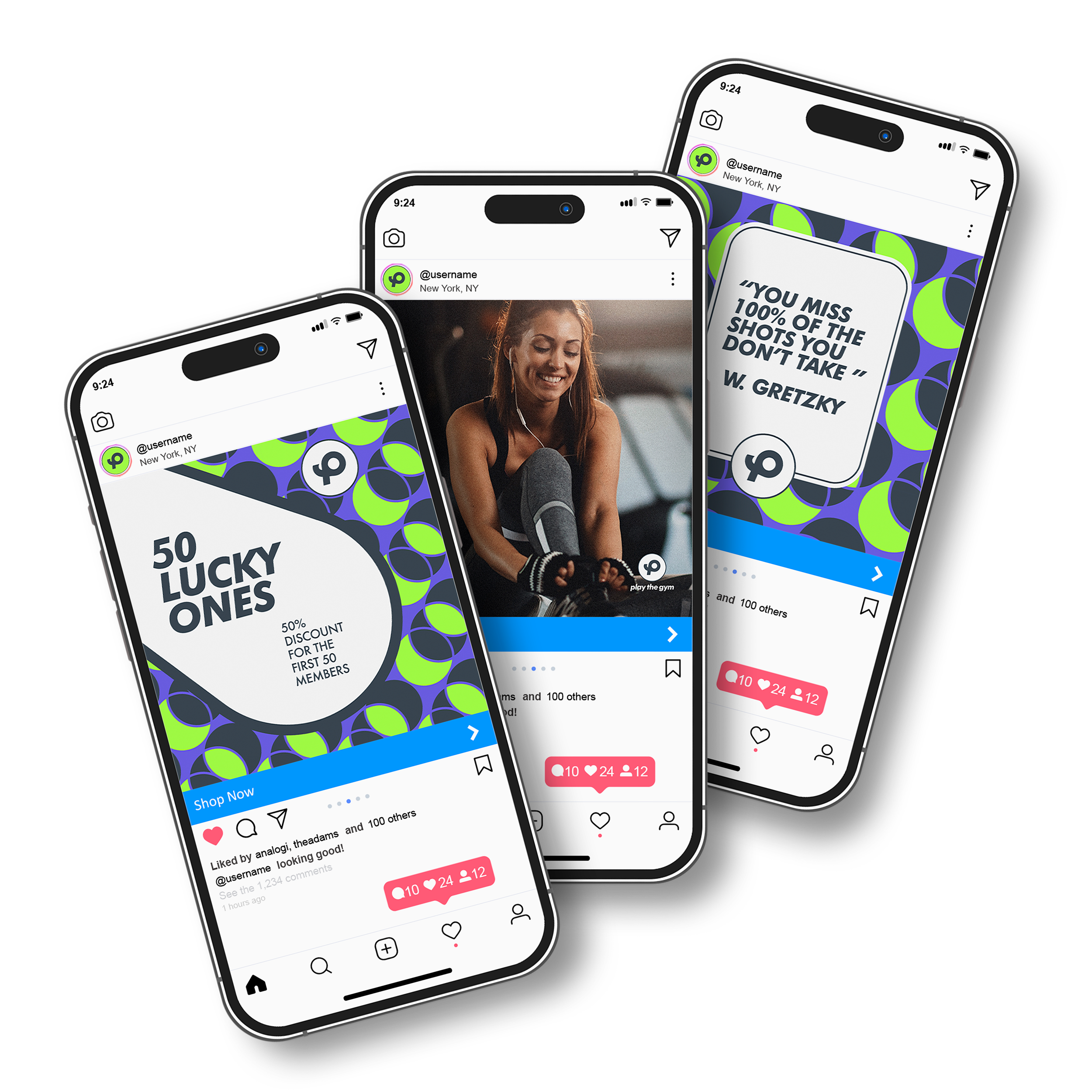


Supporting Graphics No.2


Copyright © 2025 Amarillo Works
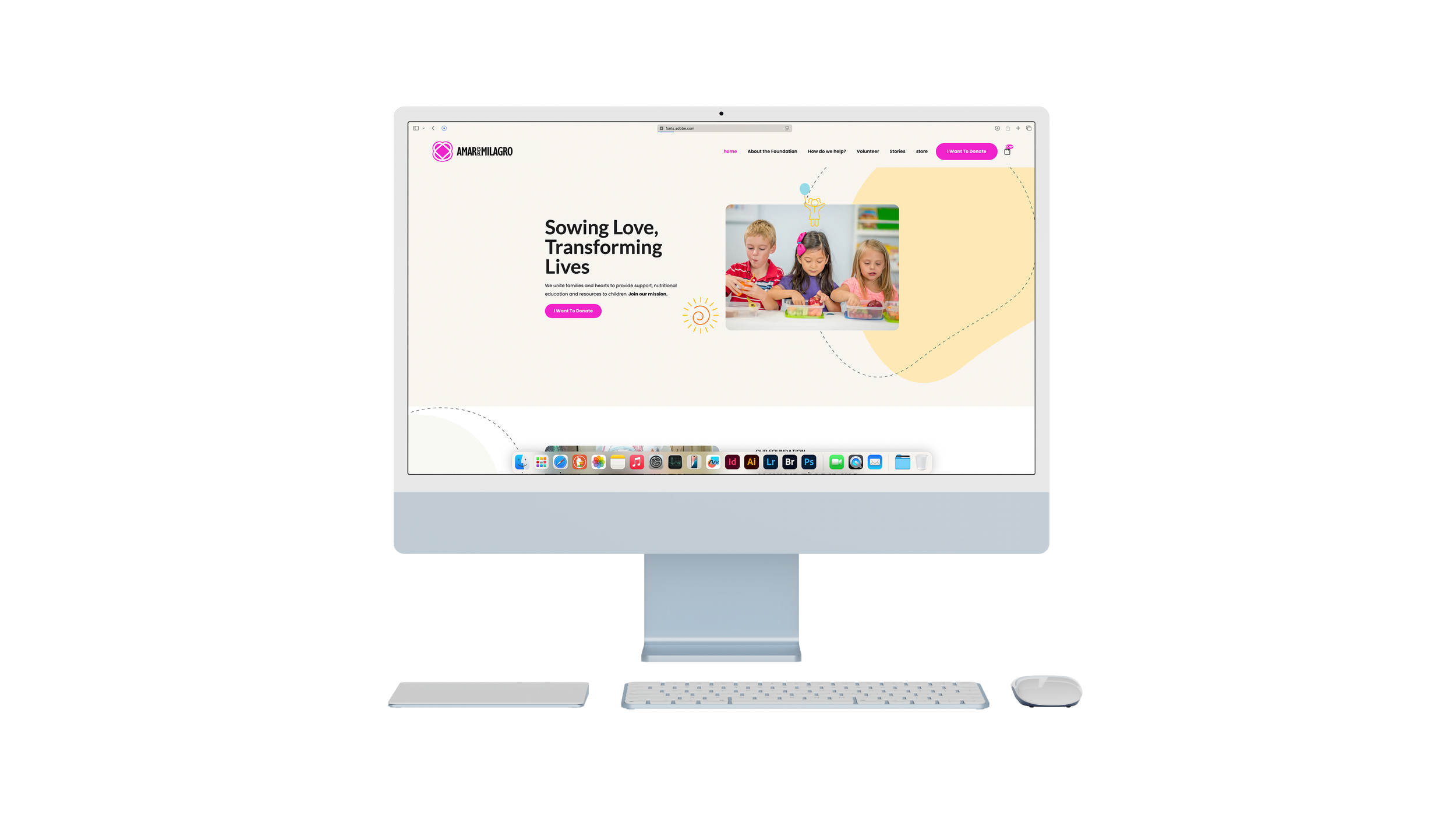
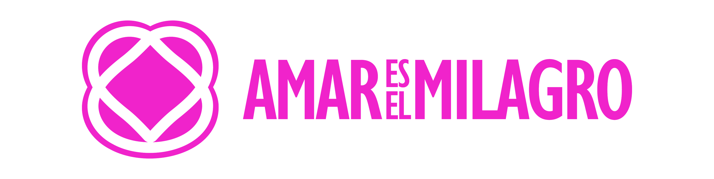
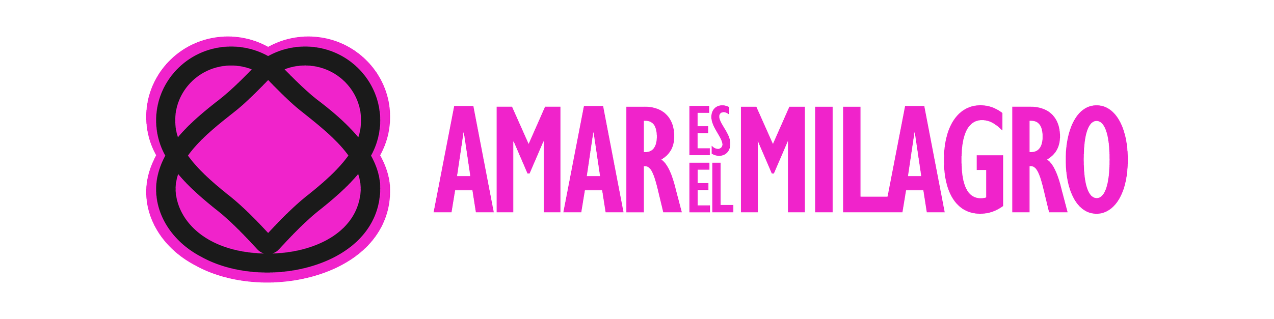
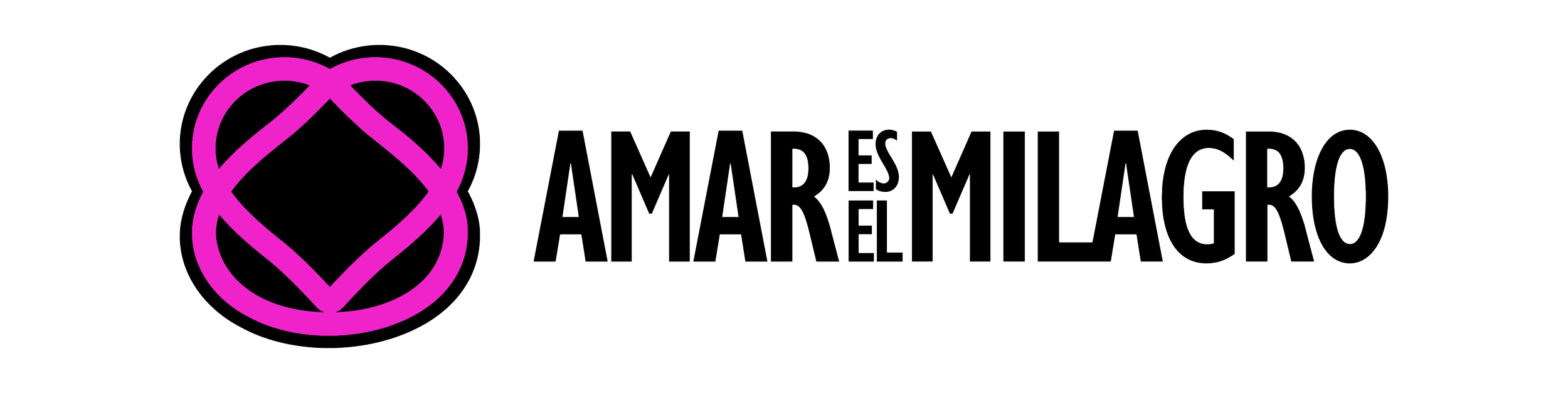
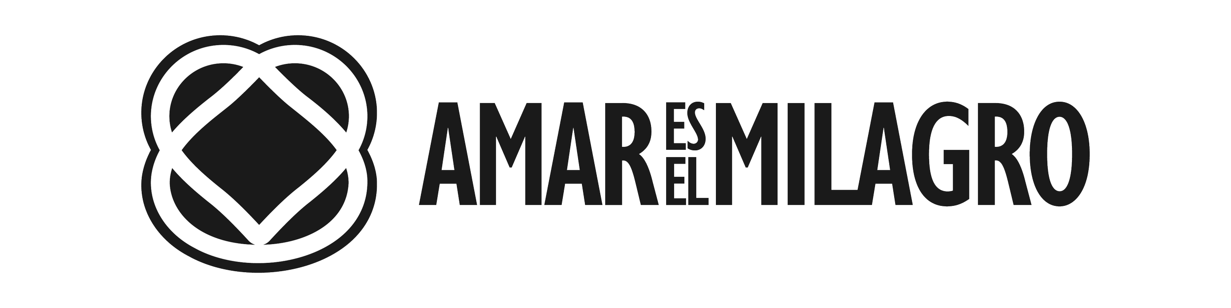
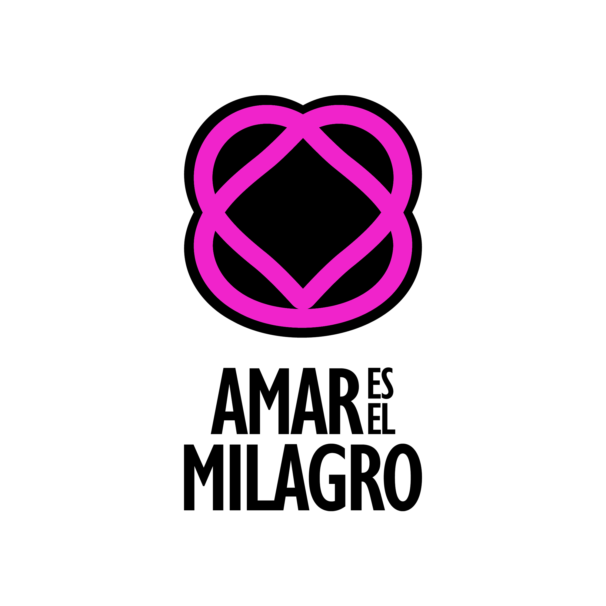
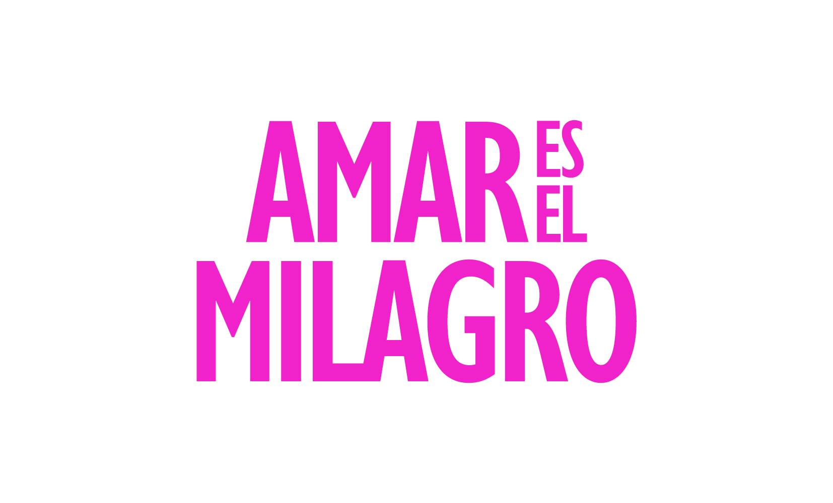
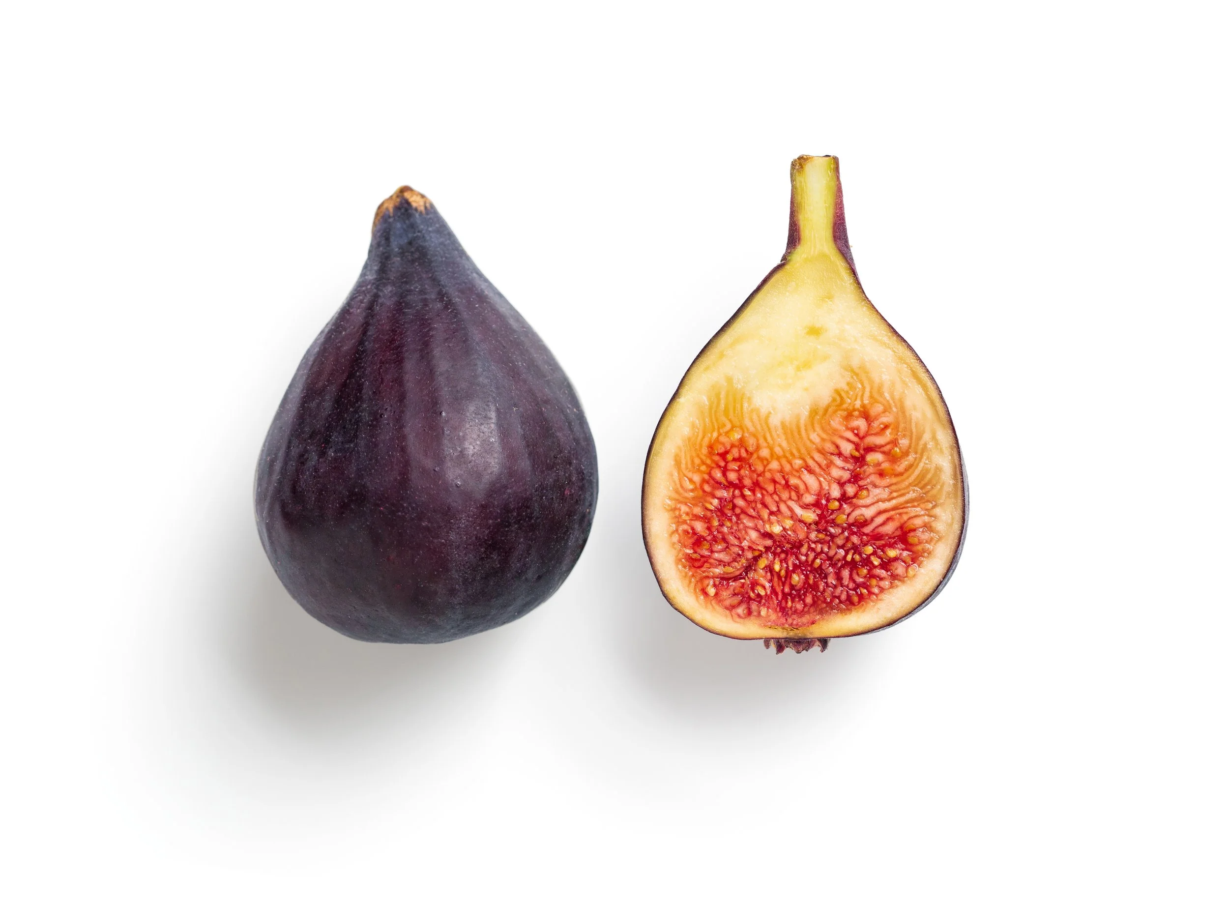
Amar es el Milagro
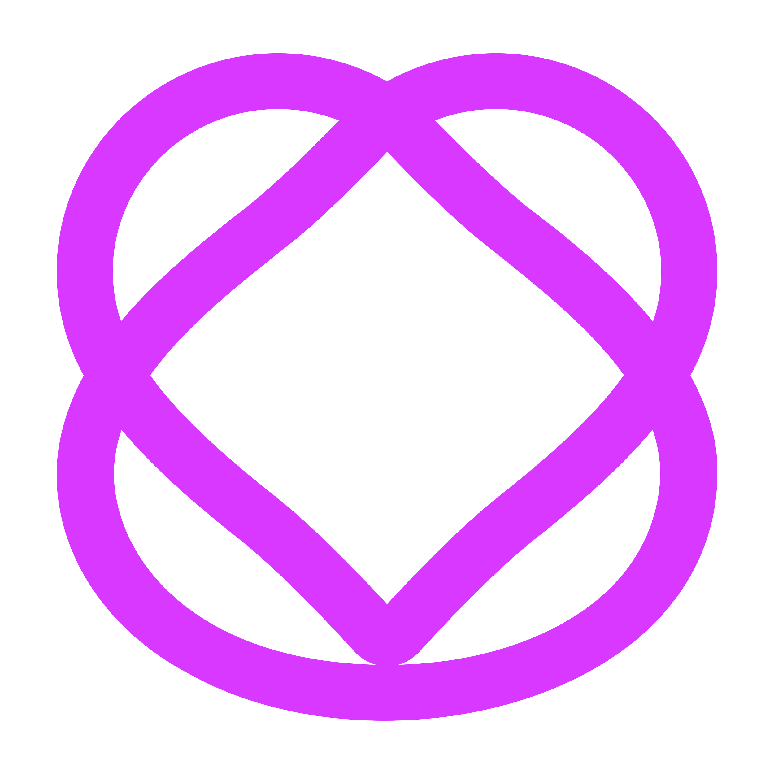
A brand identity system for an organization that helps children with Phenylketonuria, a hereditary metabolic condition that requires special care and a strict diet.
Finding the right shape
The brand mark for Amar es el Milagro combines the silhouette of a heart, an icon of love, with the fig, a fruit often referred to as the “fruit of the miracle” and a symbol of health.
The fusion creates a third, unique form based on axial geometry, ideal for both digital and print use. Its balanced structure allows for clear visibility at small scales, making it perfect for favicons, social media avatars, and compact logo applications.


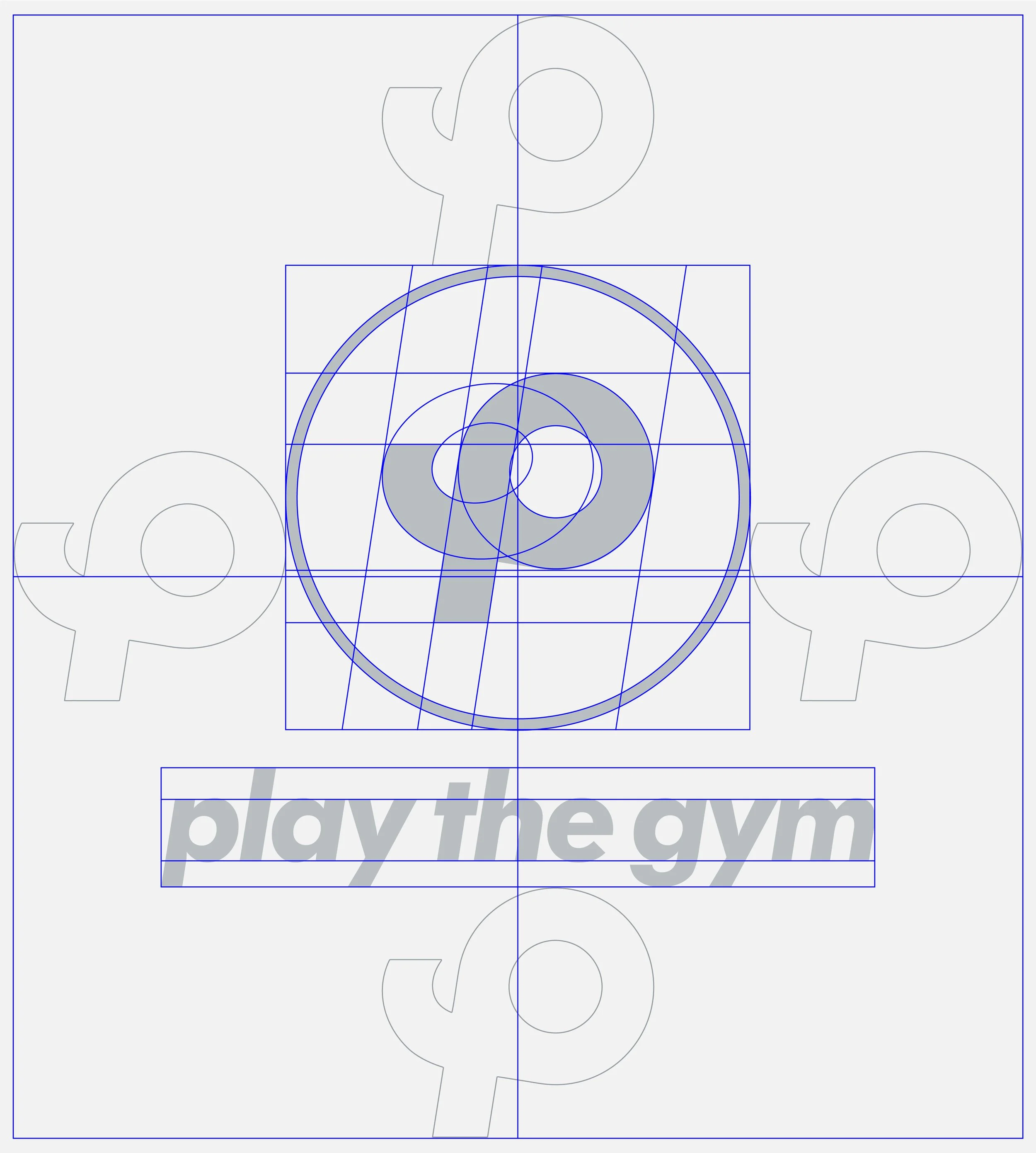
The Brand Grid
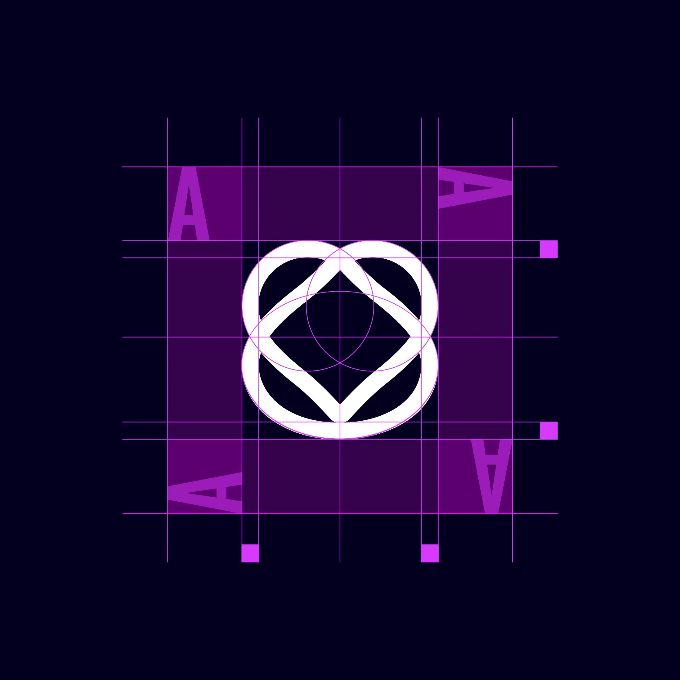
Designing the brand mark inside a grid allows for formal consistency and precision.
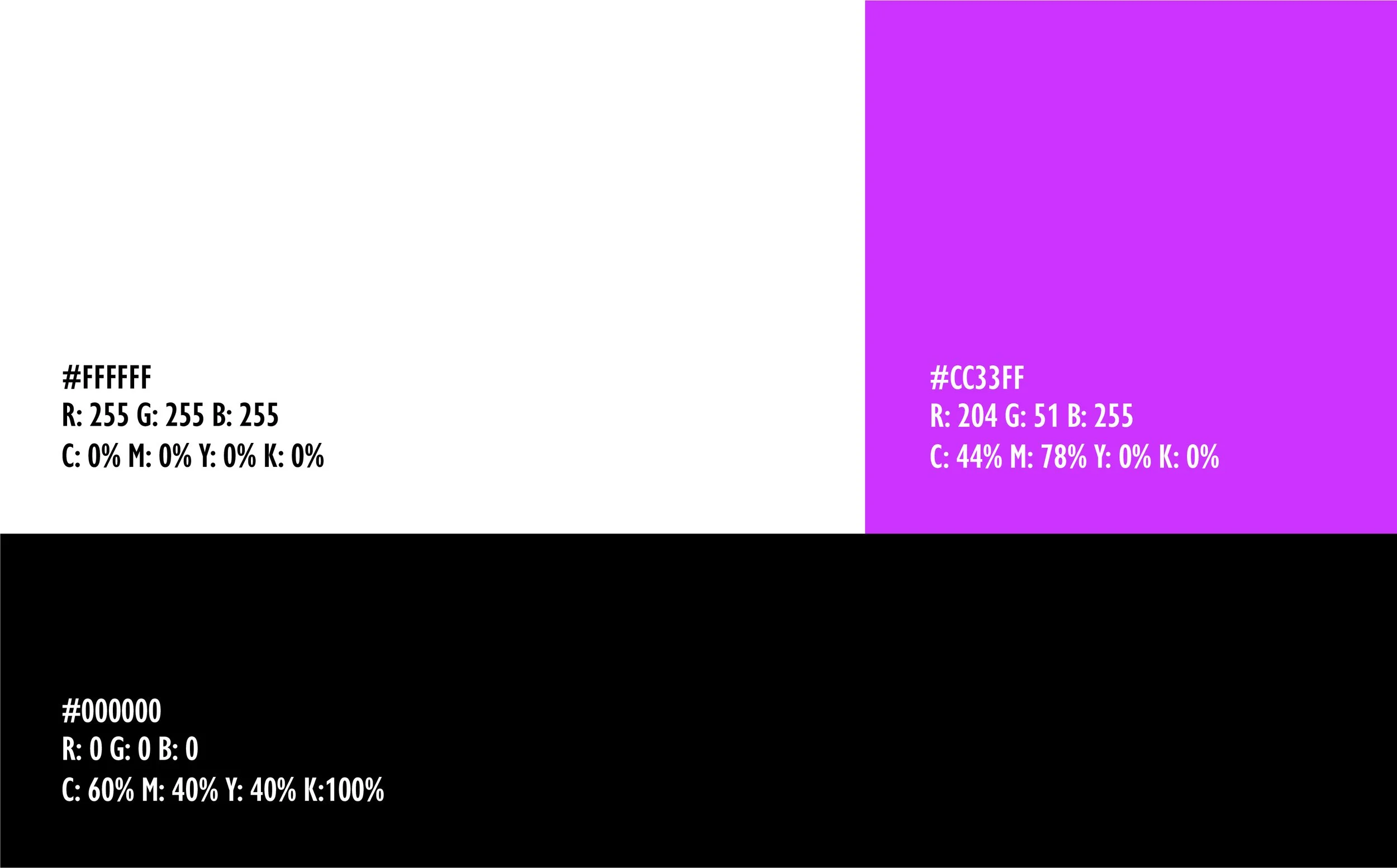
The Color Palette

Typography Selection
Brand Applications